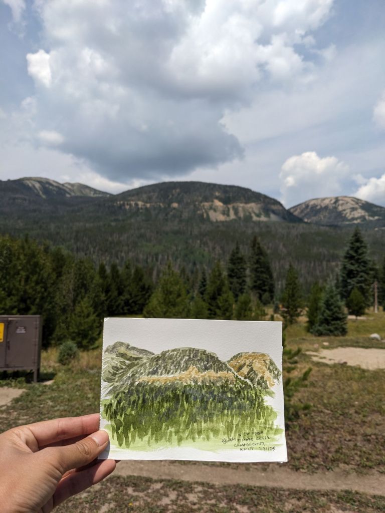
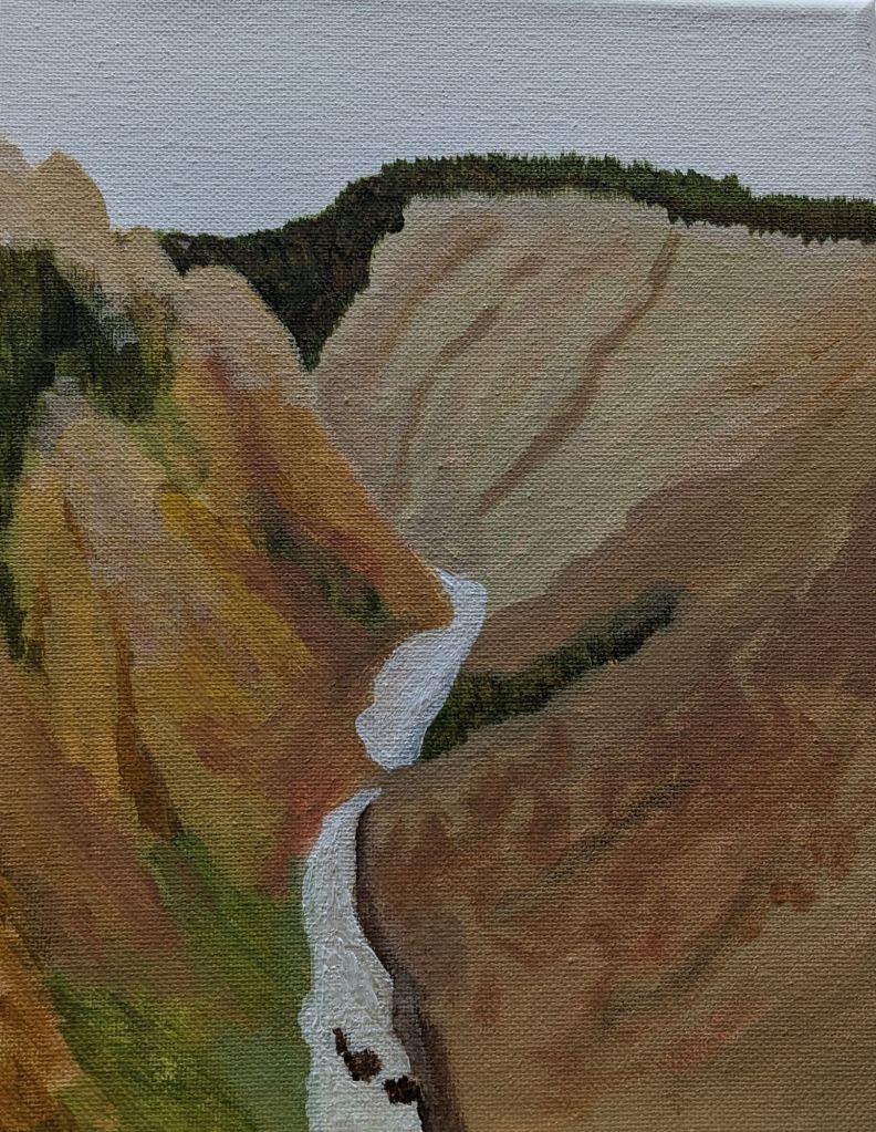
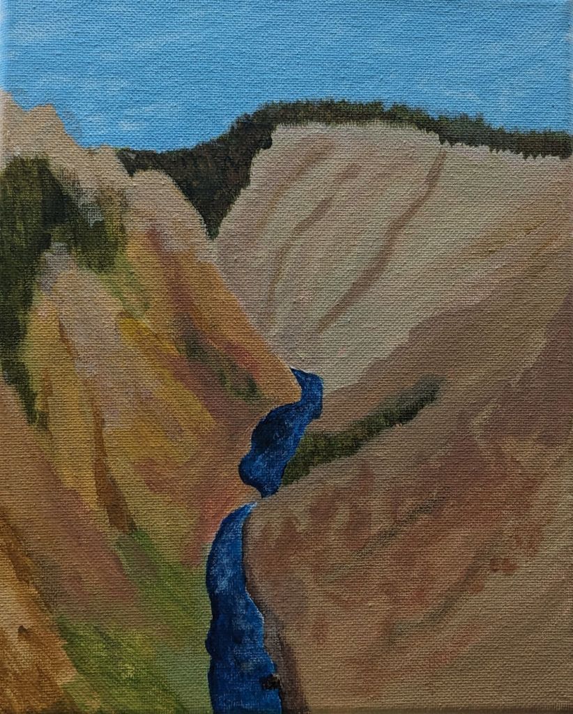
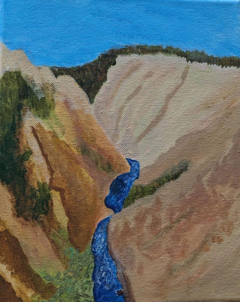
This lil postcard features the Grand Ditch, a water diversion structure that takes water from the tops of the Never Summer Mountains on the *west* side of the Continental Divide and ports it to the Cache la Poudre River, leading to the South Platte River. Part of this trip was dedicated to feeling some civil-engineering-and-climate-change-related feelings about the Colorado River and the development of Colorado. The Grand Ditch and Colorado-Big Thompson project enabled and continue to supply water for agriculture, industry, and municipalities on the *east* side of the Continental Divide, and these diversions have significant impacts on the Colorado River watershed by reducing the flow that would have been there.
On the left, I did the pen sketch first, and then the watercolor – I kind of like the differences between the paintings I do with pen and without, the pen ones end up more… tiny and detailed? But somehow feel restrained, or constrained? On the right I did a watercolor sketch underneath the color, and it ends up bold, and colorful, and not quite “accurate”, I focus more on color zones instead of lines.
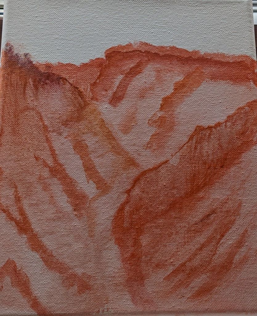
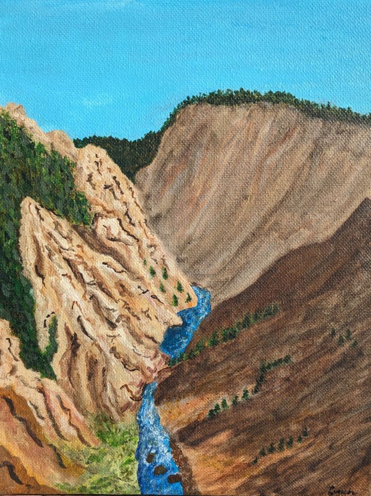
I wanted to do a painting that had less detail and focused on big blocks of color to minimize all the painting of trees (my least favorite and least satisfying step). From the initial marker drawing (top right), it took me 2 minutes to add the pen details, and then 16 minutes to add the watercolor.
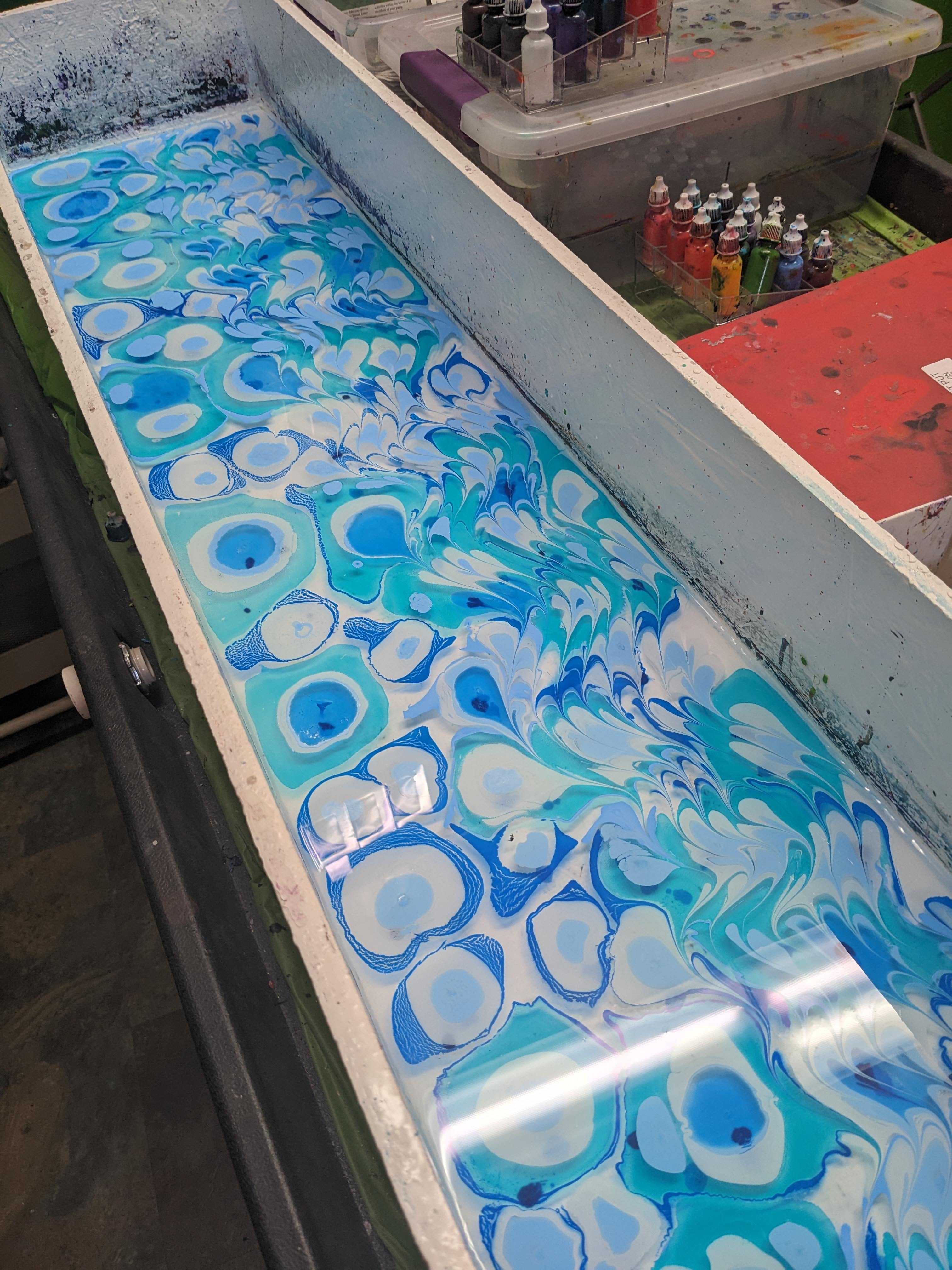
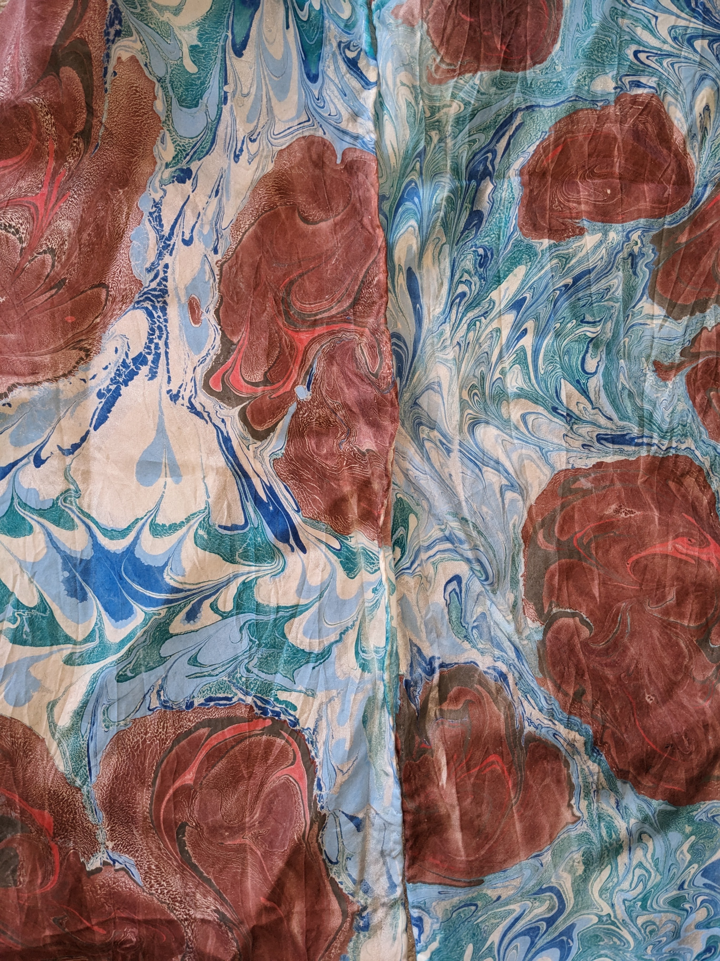
The silk marbling was incredibly meditative and calming, just dropping in the colors and swirling them together. I was going for a “river rocks” type of design and I think I really got it.
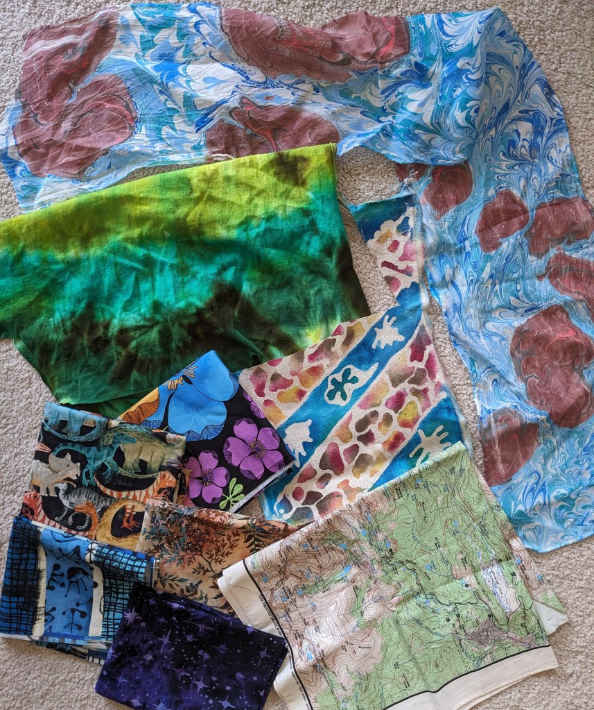
Finished river rocks marbling on the top and right, sleeve of the tie dyed shirt on the left, batik inspired by the Grand Ditch in the middle, fabric from Grand Lake on the bottom left, and the RMNP map bandana on the bottom right.
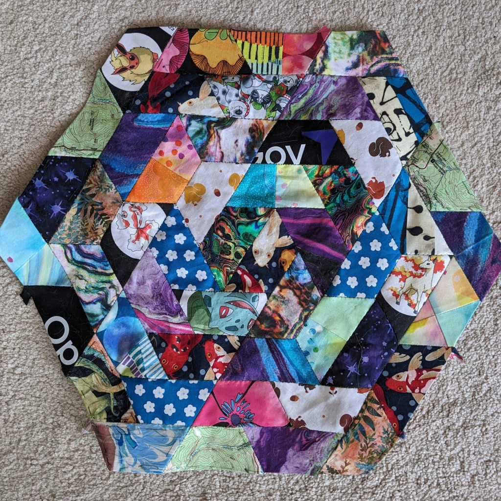
And I added my new fabric into my current project, an English Paper Piecing quilt of trapezoids for my bathroom 🙂 which now, of course, vaguely smells like campfire, but that’ll fade.
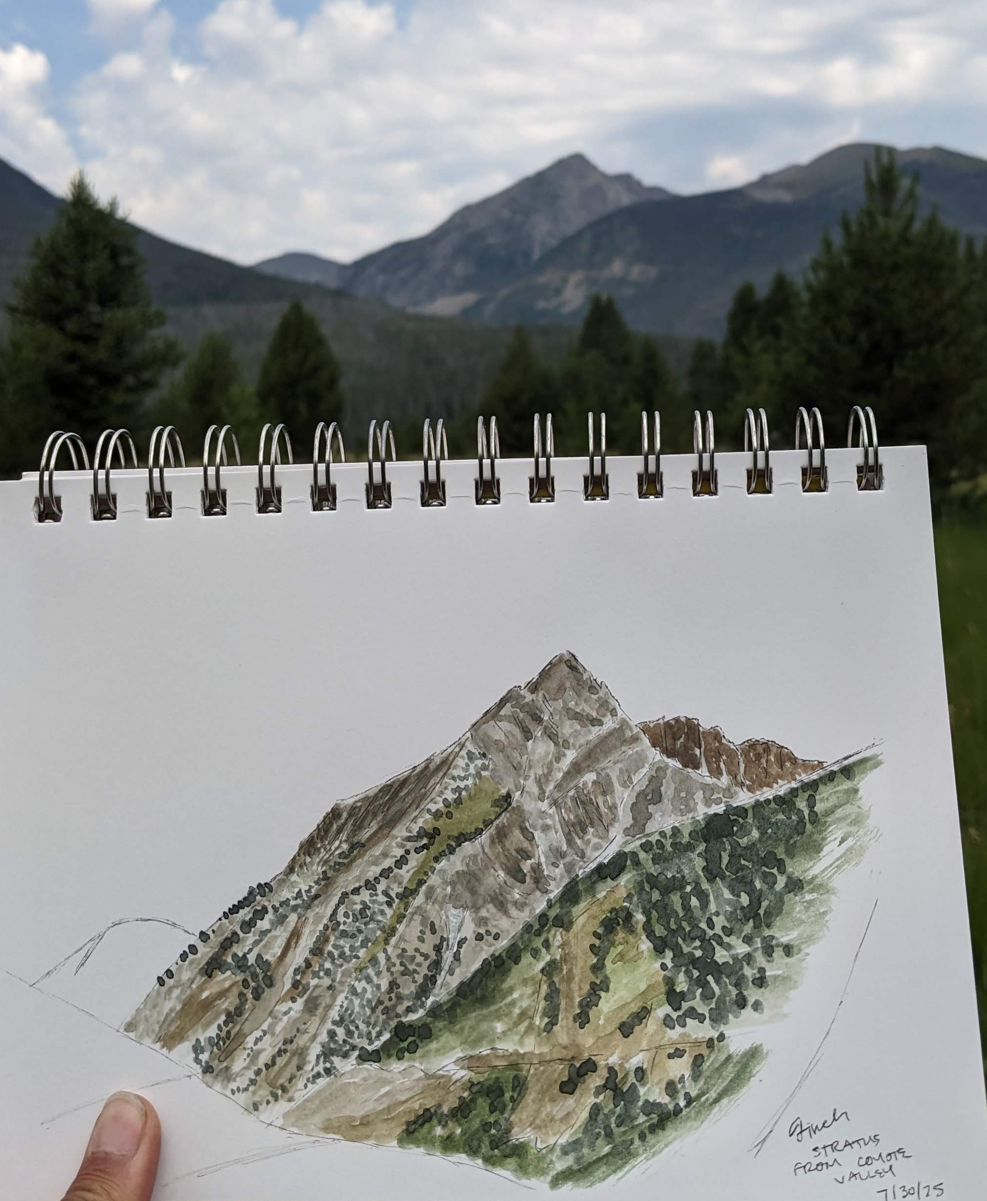
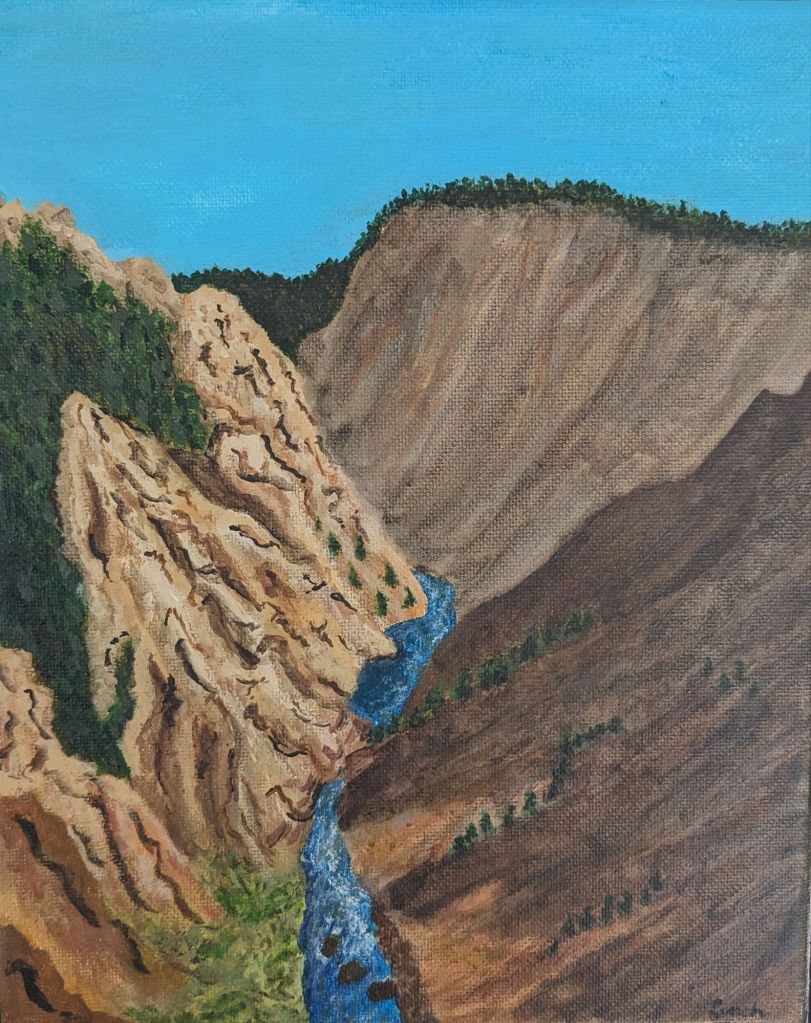
This is the painting I went to do, and I hiked a new trail to do it! Adding the color to the sketch from the left took 40 minutes 🙂 And a few people stopped to comment and talk to me, which I usually appreciate as long as they are respectful and treat me like a person instead of content.
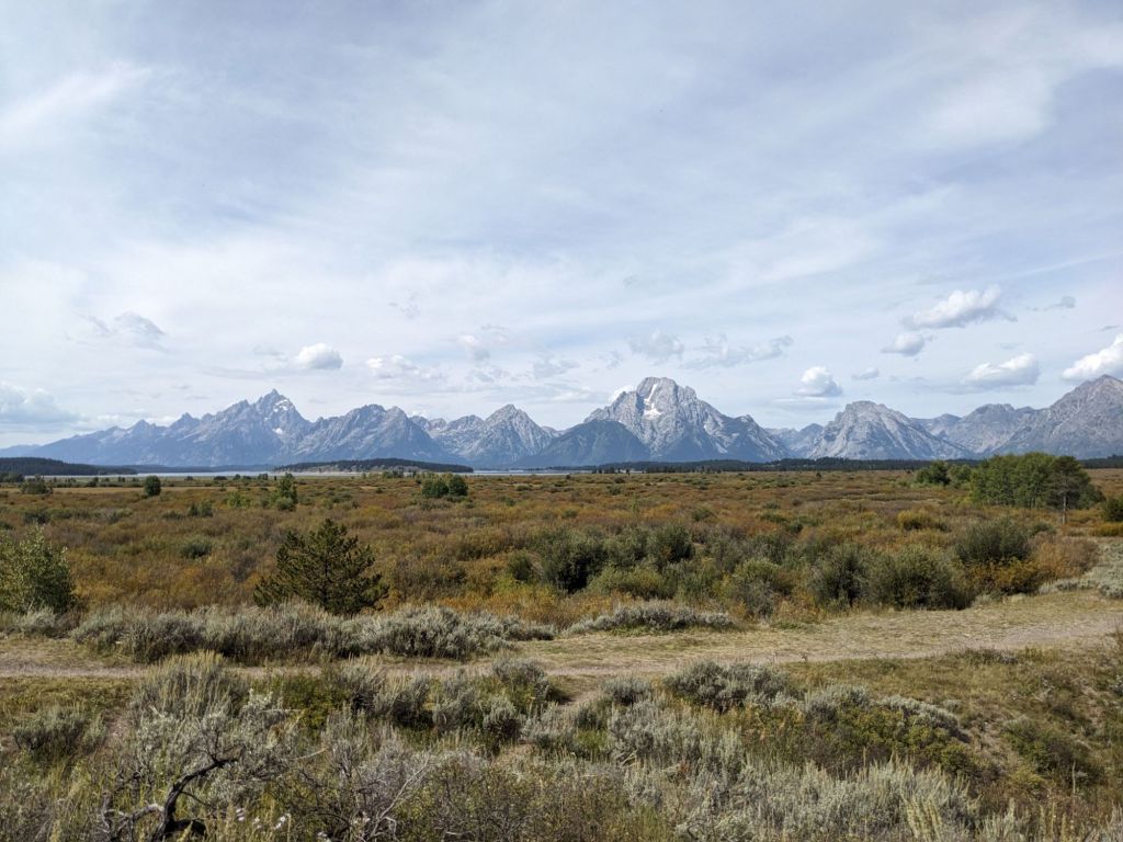
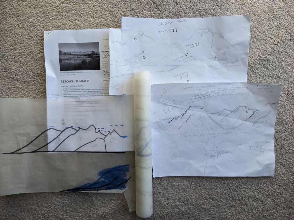
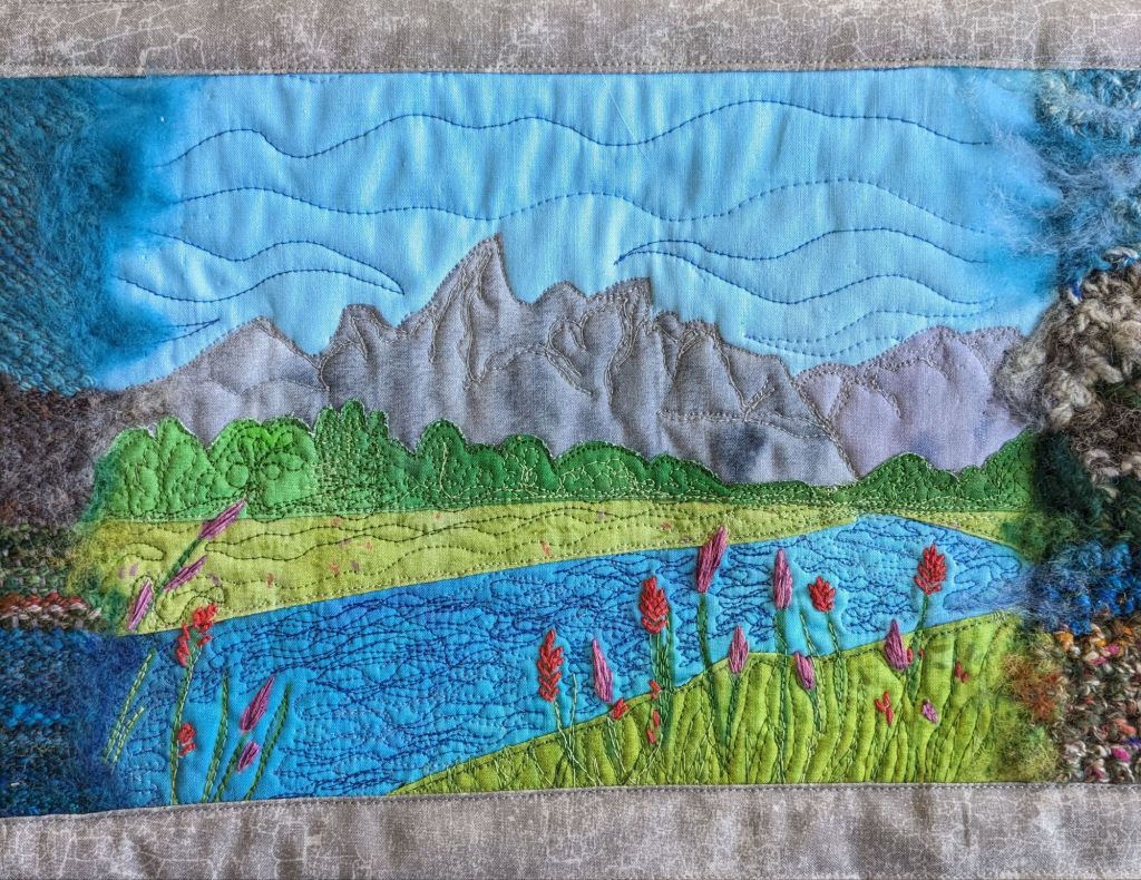
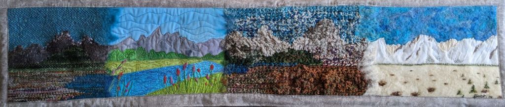
So I’ve collected a lot of skills 🙂 and after picking up a “summer” quilting kit from the Grand Tetons last year, I wanted to expand that project into a Whole Big Thing. The kit references the possibility of doing the same scene but with different fabrics for different seasons, but I wanted to do a full panorama with different peaks, depicting as much as I could of the Teton Range. I used some tracing paper to plan out panels for each of the four seasons, scaled so they’d match up with the quilted panel. My main reference photo is from Willow Flats Overlook when I visited in 2023. The perspective of the quilt is a bit different, but I kind of… made it work.
Main reference photo from Willow Flats OverlookPlans! The tracing paper rolls out into the whole panorama but having individual pieces was better while I worked.
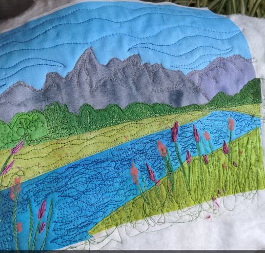
I started off with the applique quilting kit and added some free motion quilting for details. It was really fun to work on things on a smaller canvas and be able to do details without getting overwhelmed. I also added some hand embroidery for the flowers because I wanted them to pop out 🙂
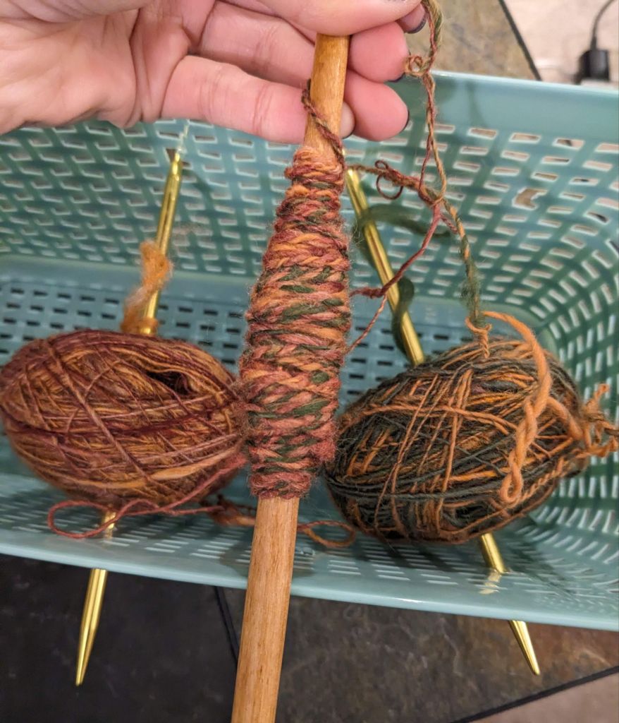
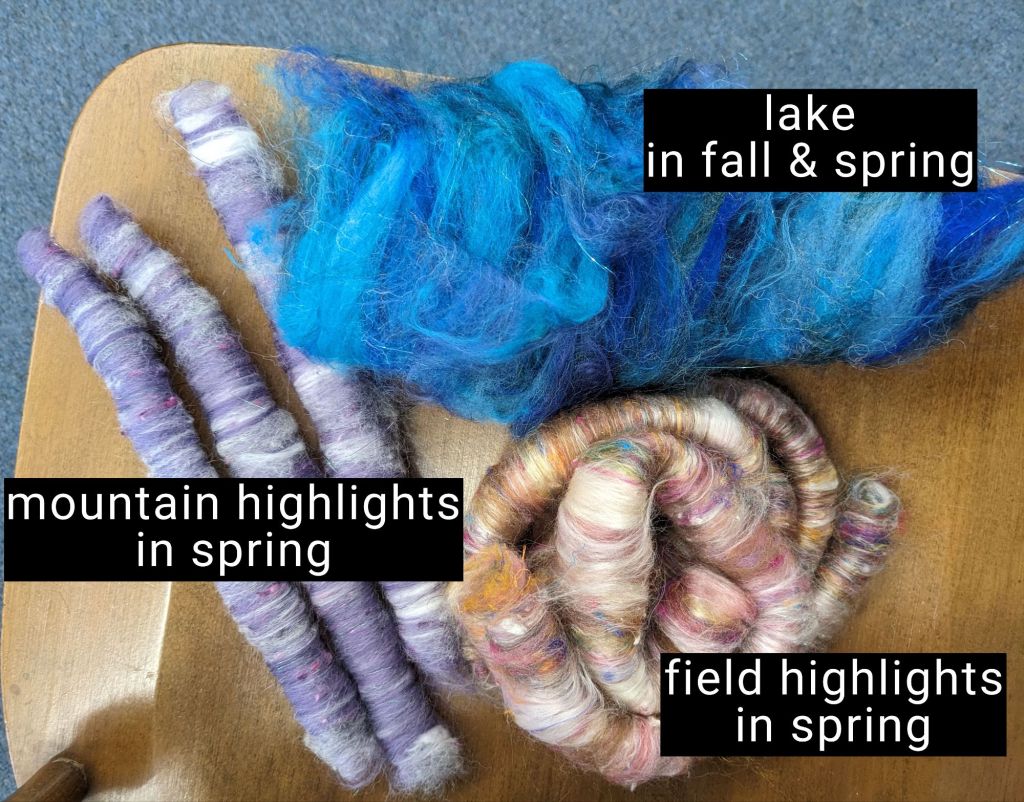
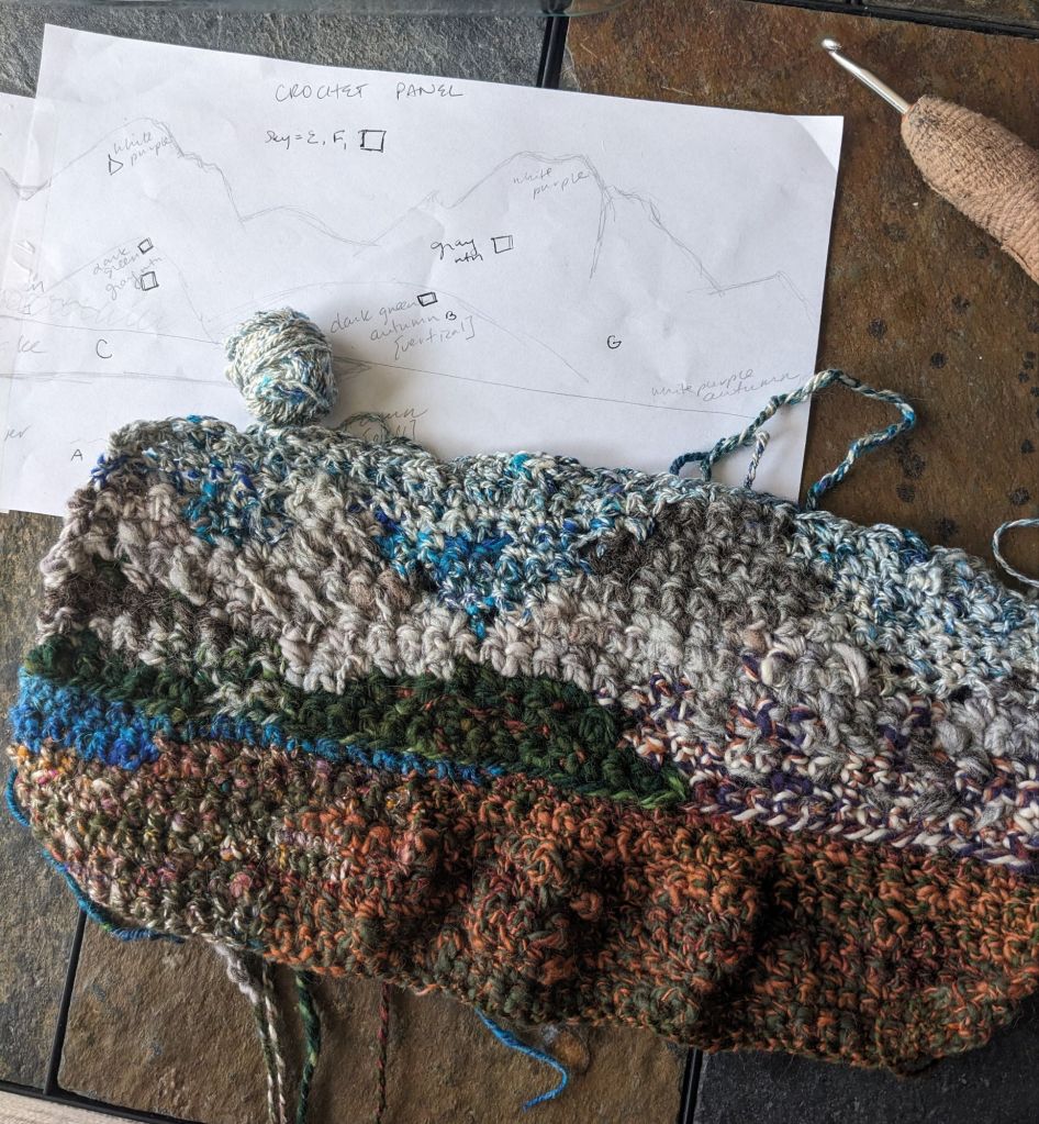
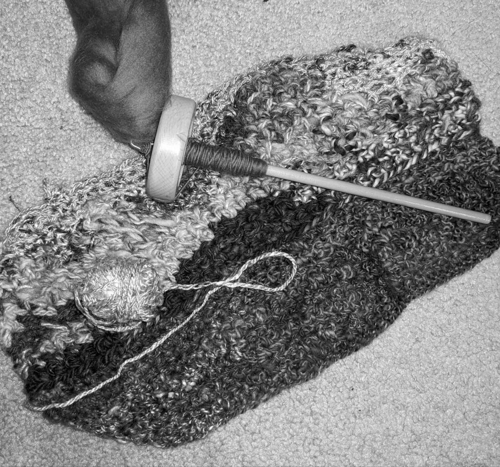
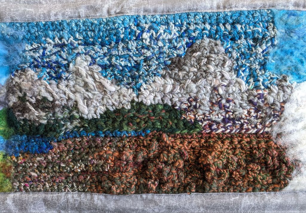
My first instinct for the next panel was to use crochet, using some funky colorwork and textured stitches. I spun up yarn for each of the different sections: sky, lake, mountains of various white and gray mixes, and autumn-y colors for the sagebrush.
a yarn I called “Autumn” 🙂
fiber blends I made at a workshop
I added some weird bumpy parts and extra stitches in the foreground to mimic the fluffy sagebrush 🙂
I struggled with getting enough contrast between the gray of the mountains and the blue of the sky, so I took a black and white picture and spun up some darker blue that I could blend into the existing sky.
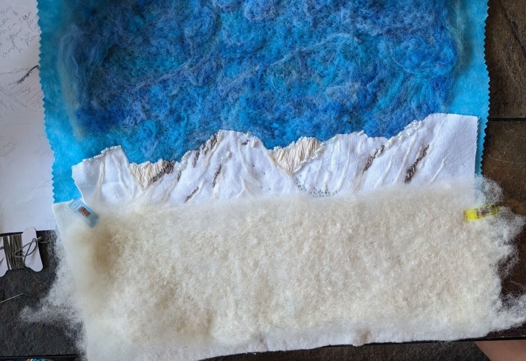
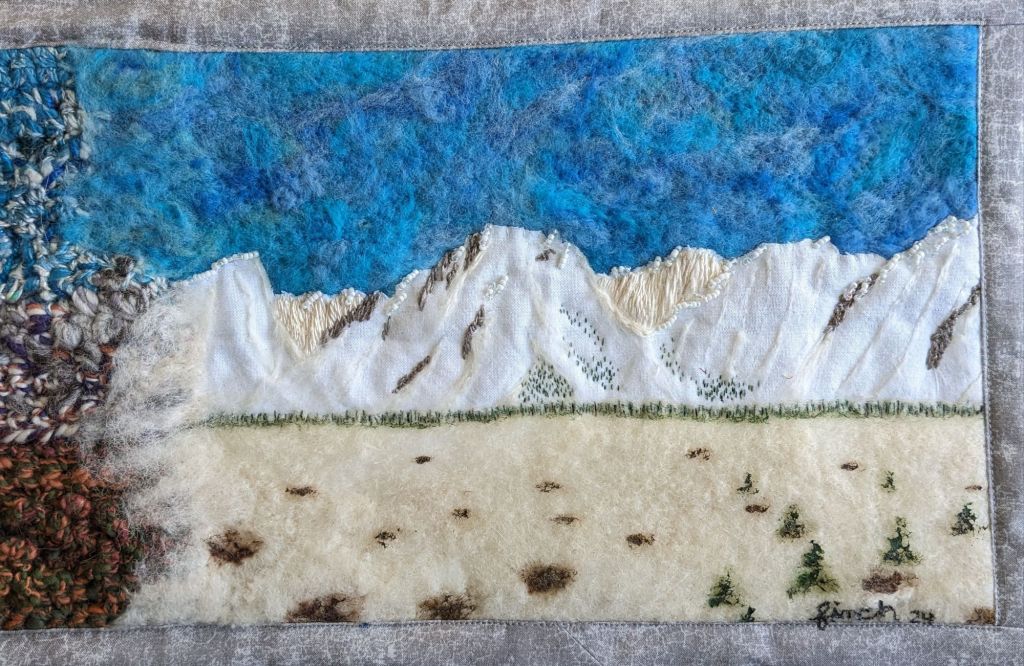
After I had summer and autumn, I struggled with what to do next. I knew I wanted an embroidery panel and a woven panel, but I wasn’t sure which should be spring and which should be winter. I talked it over with a friend and we decided that the crochet shouldn’t be next to the weaving, since they have similar textures and detail resolution. So winter was embroidery! I started by needle felting the background sky and foreground, to automatically add texture that I didn’t need to stitch. I spun some thin yarns of cream/white and rock gray, which was a fun challenge to spin thin enough and consistently enough that I could use it with a normal sized needle. I also thought some beads would be fun for the shininess of the snow 🙂
Winter embroidery in progress
I was planning to do the winter foreground details with embroidery, but I realized I wanted to incorporate paint into this project, so I used acrylic paint to add trees, bushes, and rocks. It was difficult to paint onto the felted surface because the brush strokes pick up fibers from the felt, but it was doable.
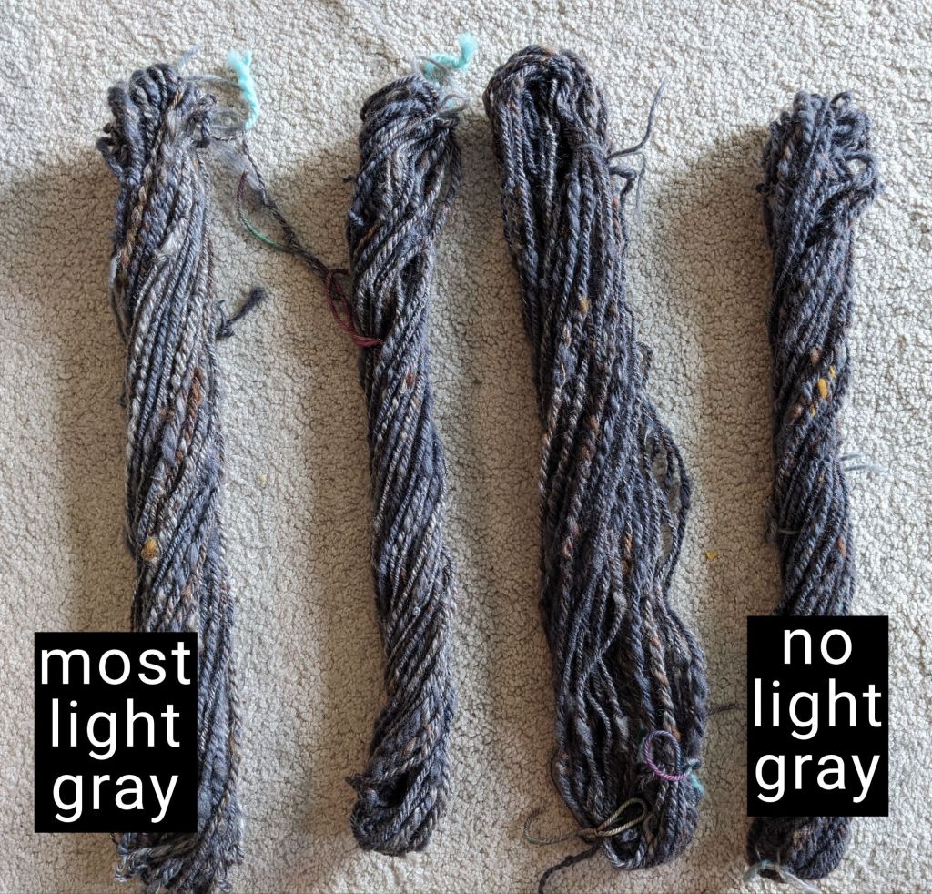
Then I needed a tapestry weaving for spring. Just like with the crochet, I only used yarns I’ve spun, and spun up a few more just for this. I had four different mountain-y layers that I wanted to represent, so I spun four different grays with graduated levels of light gray. In hindsight, I made WAY TOO MUCH, but it was fun. And now I have more mountain gray for later.
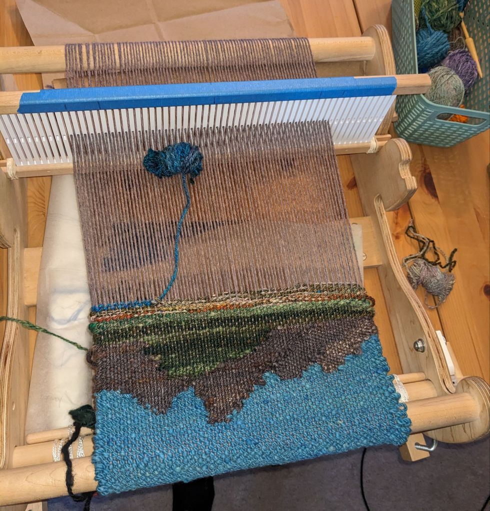
I took a weaving class where we were able to take the loom home for a week, and capitalized on this moment to (a) finish this project, and (b) see if this type of loom is useful for tapestry weaving (that’s not its primary use). It was a successful proof of concept for using this type of loom for tapestry, but I think I’m going to pursue purchasing a different kind of loom for some more flexibility and growth potential.
upside down on the loom! I wove the sky first because I knew it would be a solid weaving instead of doing a bunch of color changes… and weaving upside down made me less stressed about getting it perfect
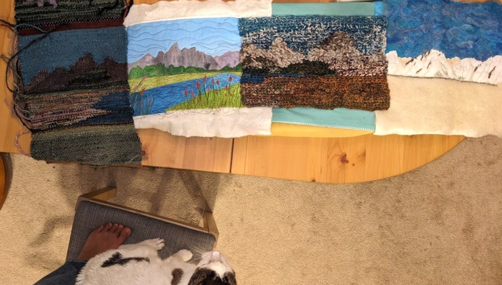
this is the first time I saw all four panels together, they’re pinned to a mini ironing board 🙂
I used some extra fiber to needle felt over the seams between the panels, and then did a border to secure everything together.
My main challenge in finishing this up was getting the crochet to sit the way I wanted it to. I ended up gluing it to some stiff scrap fabric to stabilize it, which went well…. Until I started sewing the fabric frame on. Hot glue and sewing machine needle is not a good pair. 🙂 But I took my time, learned my lesson, and got it done.
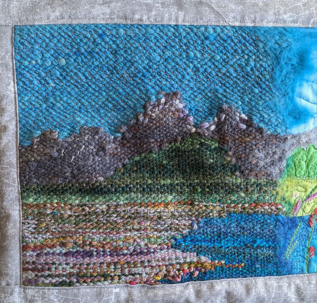
Spring! My favorite part to make was the field in the foreground, I improvised all of the color changes and just had a good timeSummer 🙂 so glad I bought this and kicked off this project. I really like the wavy lake quilting with variegated threadAutumn! I really enjoyed spinning all this yarn, and I have a lot left over for future projects. I’m pretty happy with the shading on Mt. Moran (on the right) and the weird bumpy texture of the sagebrush in the foreground Winter! I really like the contrast between the line-y-ness of the embroidery and the fuzzy needle felting, and I proved to myself that I can spin yarn to embroider with🙂 finished
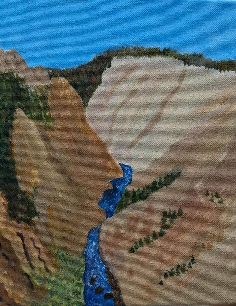
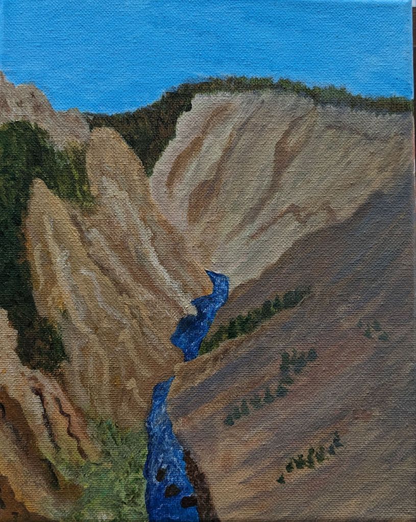
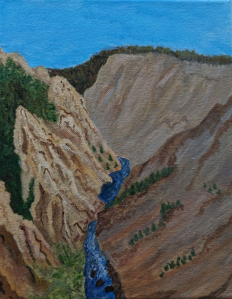
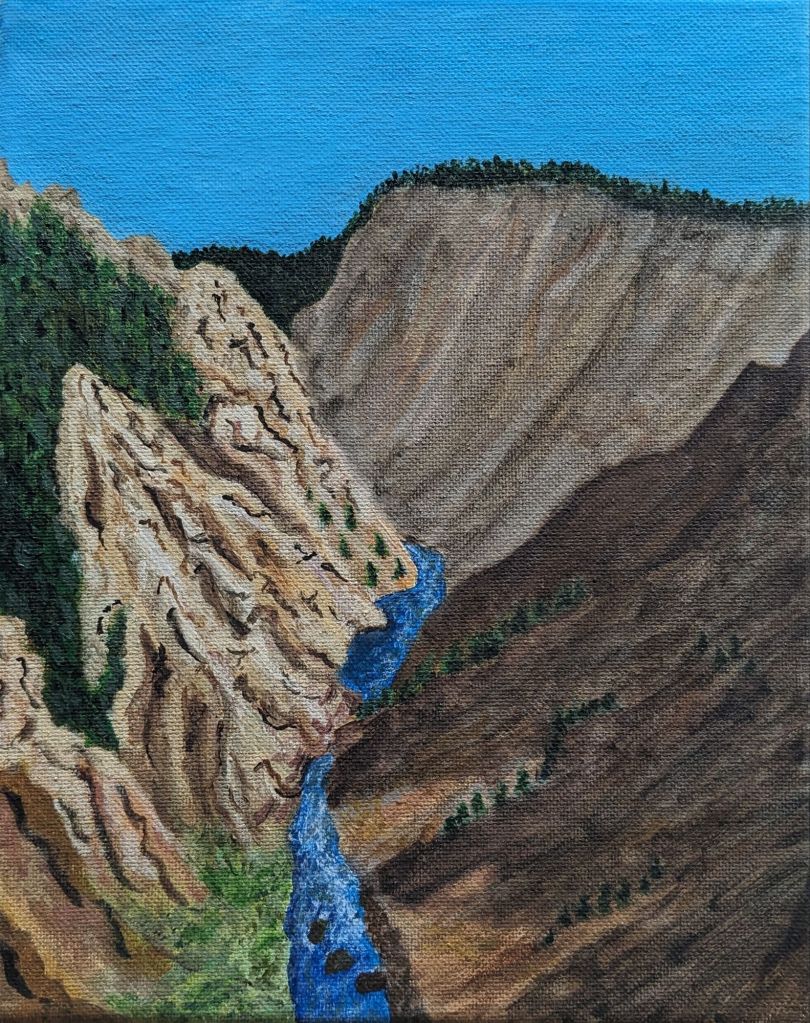
For my friend who took this trip with me, for Christmas 🙂 I had a lot of fun discovering how to do the shadows and finding out how much detail I wanted on the trees. I’ve been experimenting recently with how I depict trees, there’s usually so many of them that I lose interest and just draw lines, but that’s not really what I want to be doing. I used a bunch of different shades of green for these, and I really like how the ones on the right turned out.
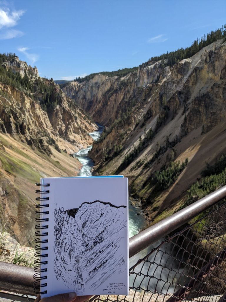
I only used my original sketch as reference, and worked the colors from memory as Thomas Moran did (though some of his sketches have colors written in pencil :)). I think it makes the final product more vivid and oversaturated, more true to how it felt to be there, and less how the camera captured it.
Indirect sunlightDirect sunlightOriginal sketch in situ 🙂
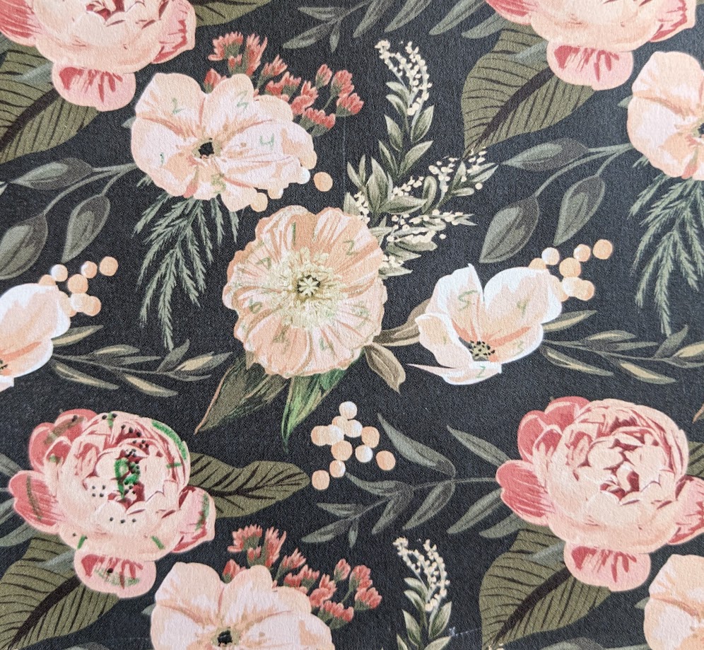
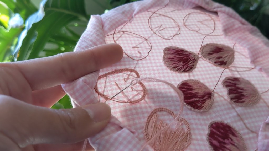
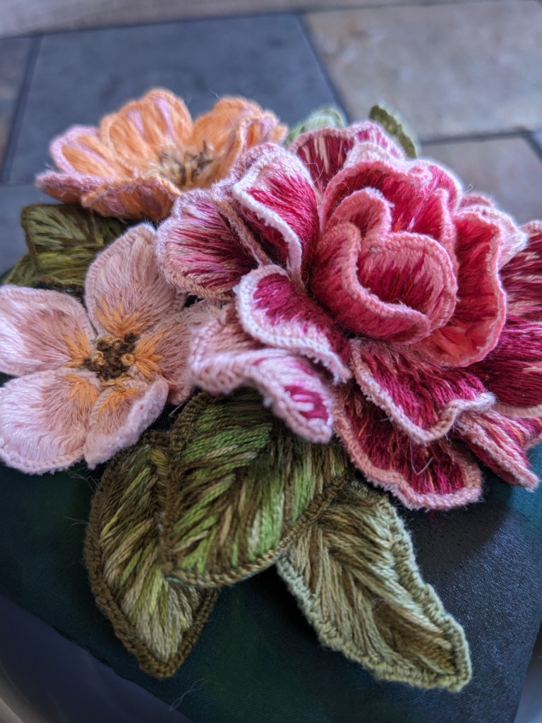
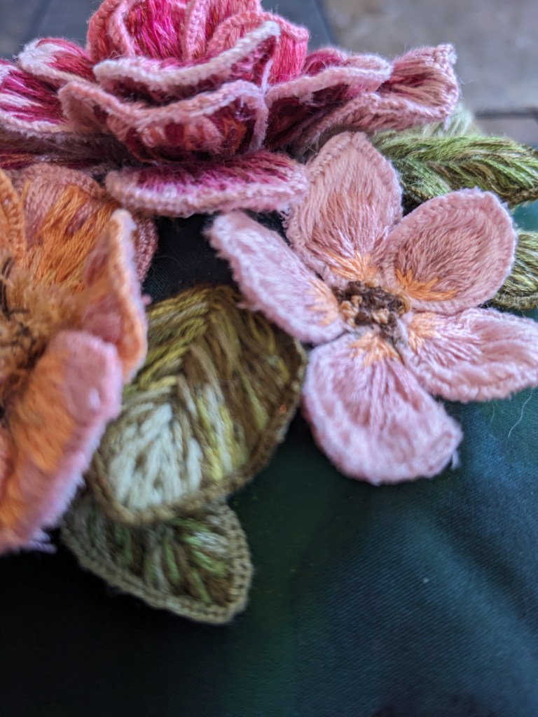
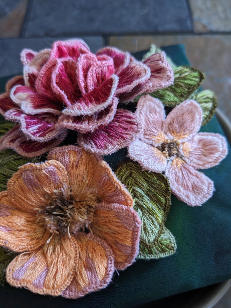
I made these for my friend and her husband, based on their “Save the Date” stationery 🙂 it was super fun to revisit the wired slips technique and bring these flowers to the third dimension.
My reference! I was originally planning to do all the flowers here, plus one from the front of the invitation, but I decided to invest my time in doing three flowers well and being patient with the color blending.
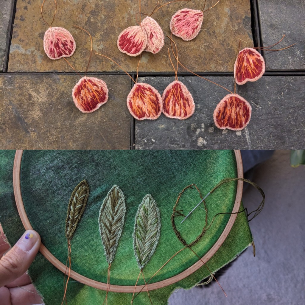
I made three different flowers; one with 5 petals (the one on the right), one with 7 petals (in the middle), and one with 20 petals (bottom left). I wanted to have different colors and textures across the flowers, and different petal shapes. The 5-petal flower has teardrop petals that come to a point, the 7-petal flower has petals with flat tops, and the 20-petal flower has rectangular heart shaped petals.
Working around the border of a petal with buttonhole stitchTop: back of petals that are cut out and ready; Bottom: leaves still on the hoop
I poked the petals into one layer of fabric and folded the ends up, then embroidered the center stamens and pistils onto the fabric and anchored the petals to the fabric. Then I added in the leaves and made tiny stitches between petals and leaves and into the base fabric to secure all the elements together. I added another layer of fabric underneath the base fabric for some structural stability, and glued the entire assembly to a square canvas. The plain background ended up too plain, so I added some watercolor to the background to spruce it up and give it the idea of more leaves in the distance.
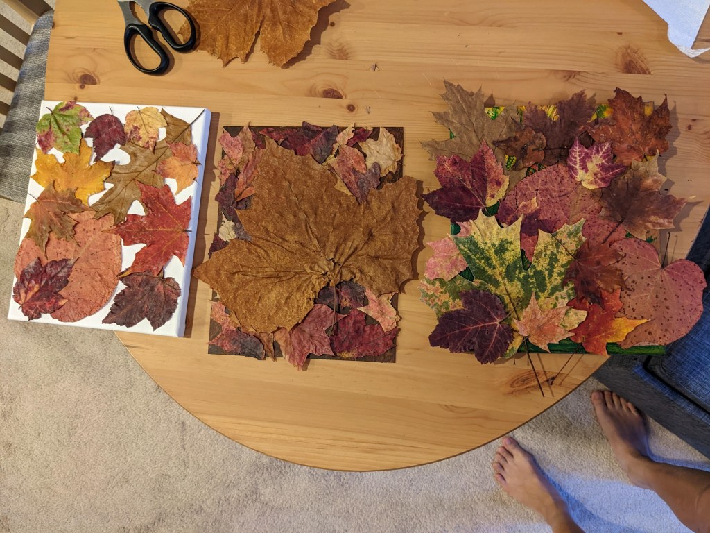
Been making a lot of different kinds of things! I’m reaching into multimedia and experimenting with new materials and techniques. 🙂
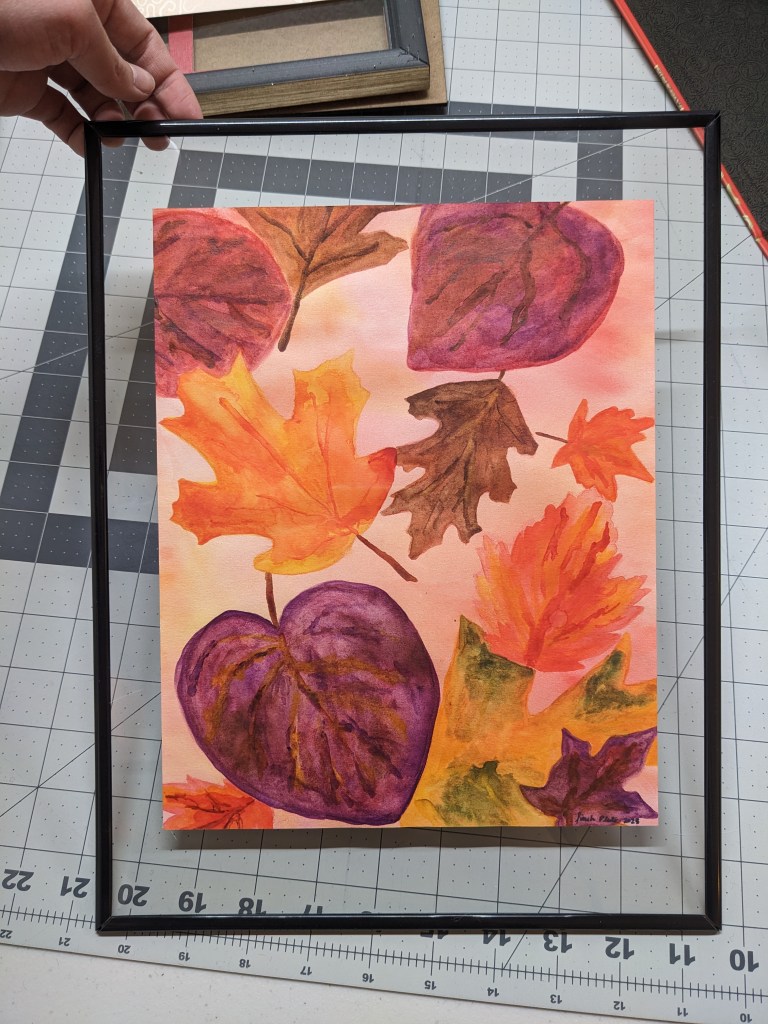
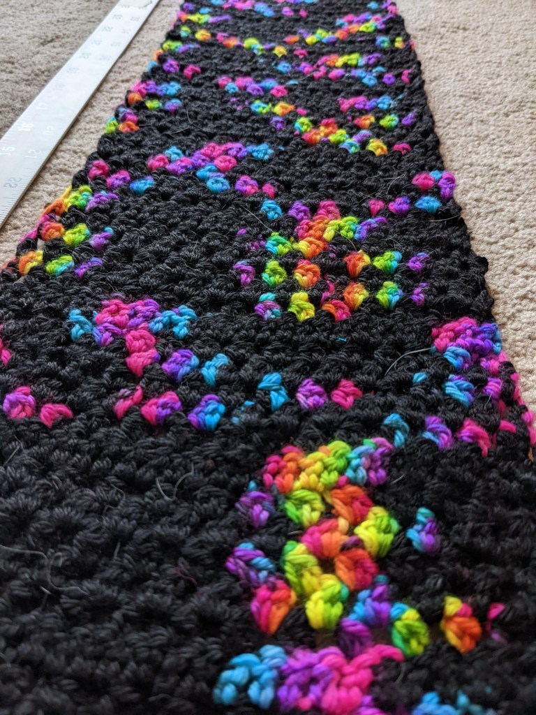
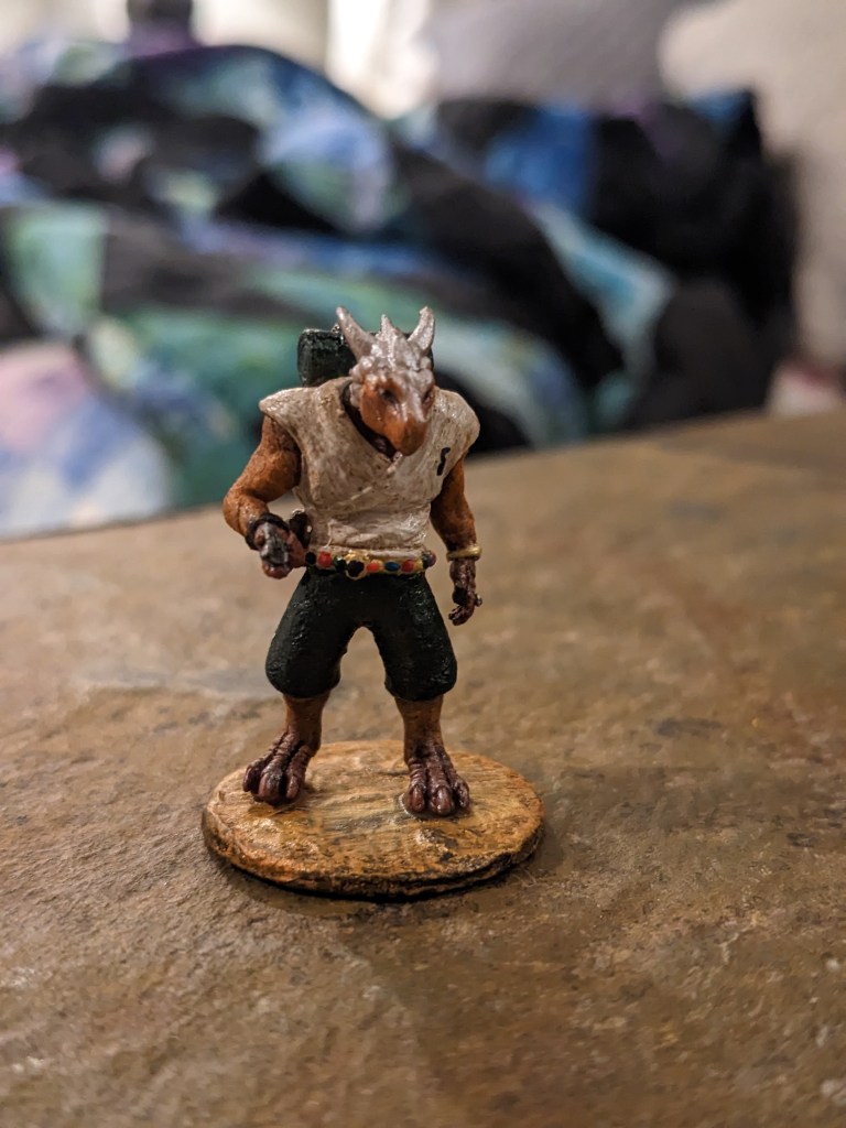
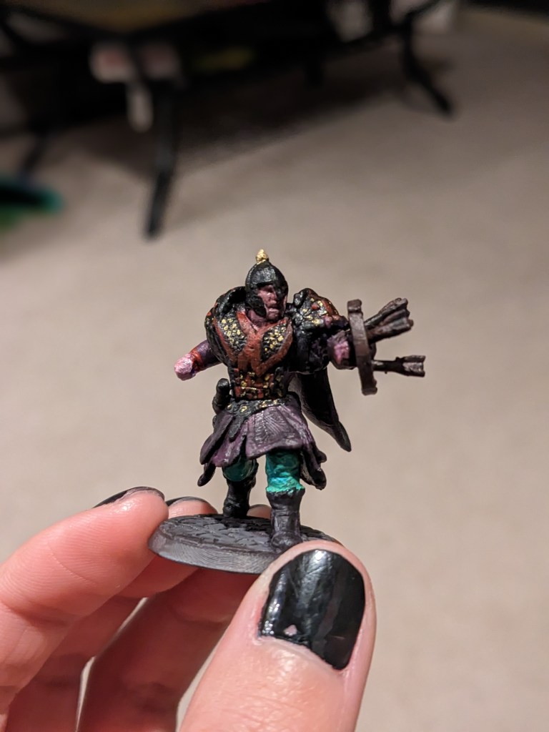
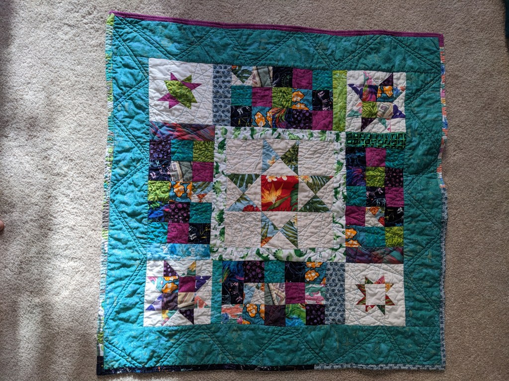
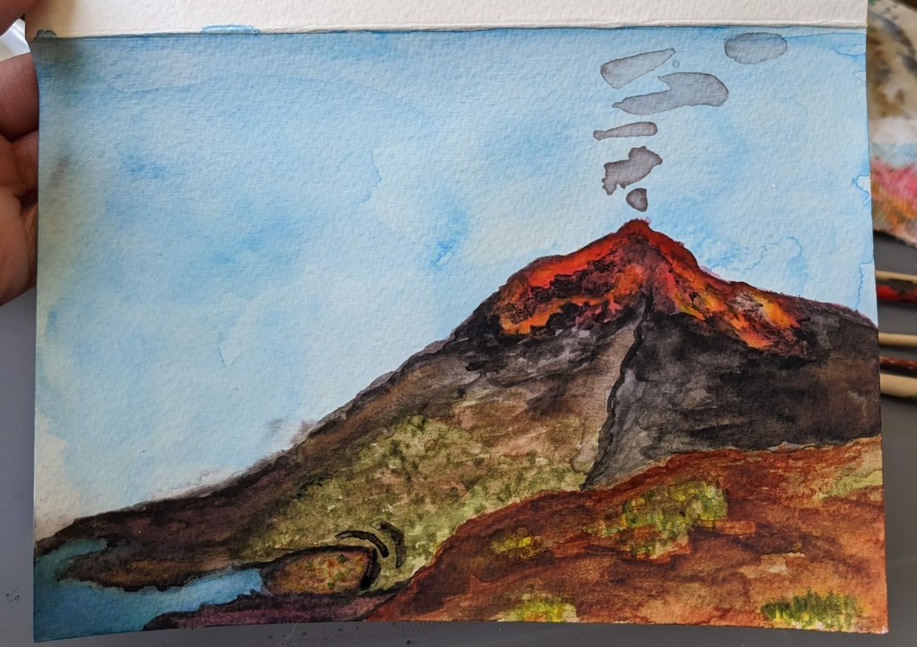
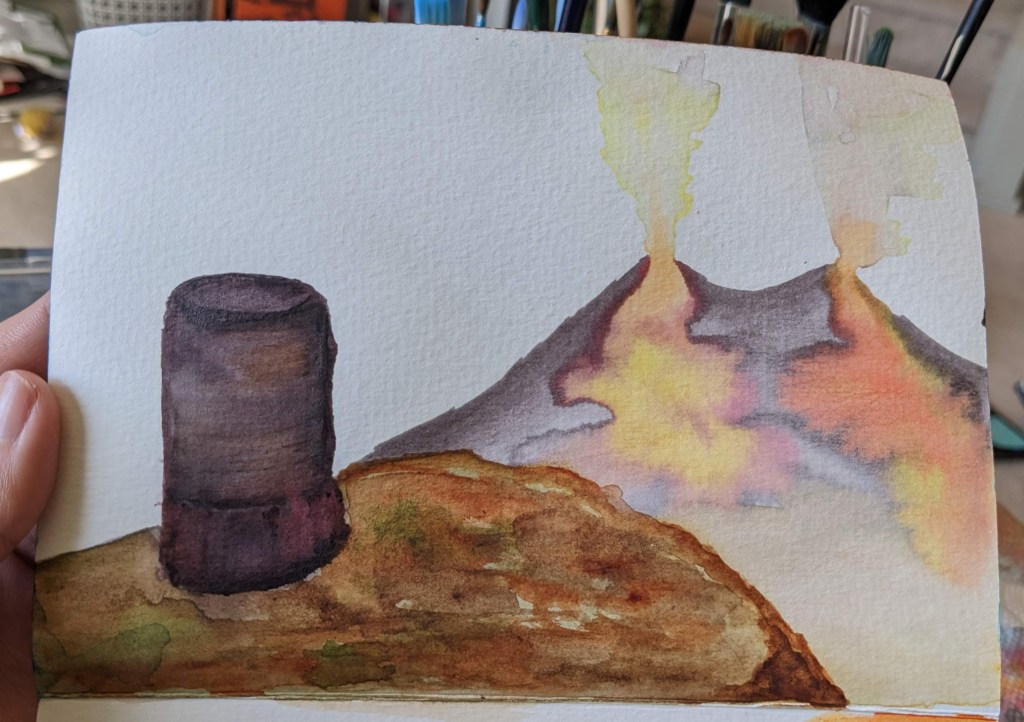
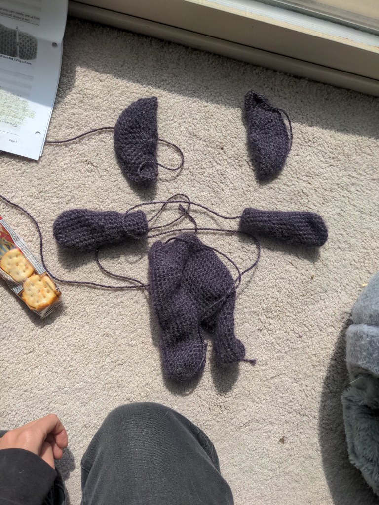
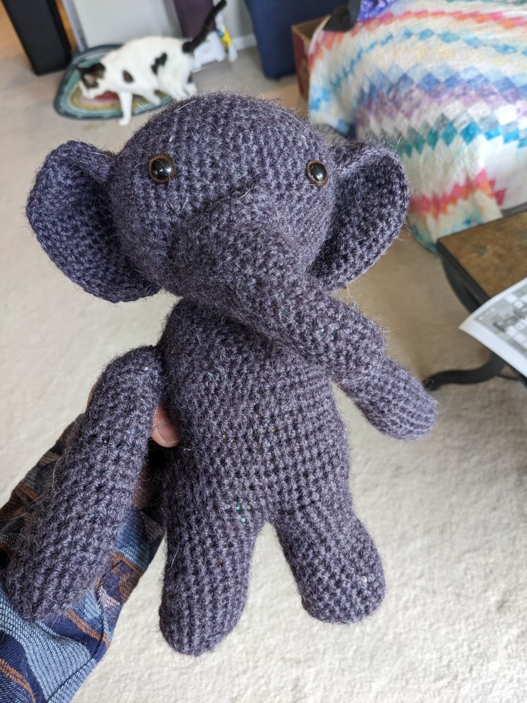
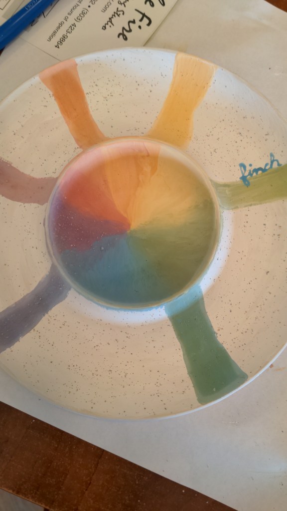
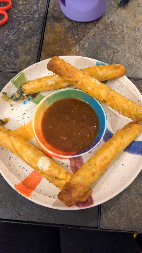
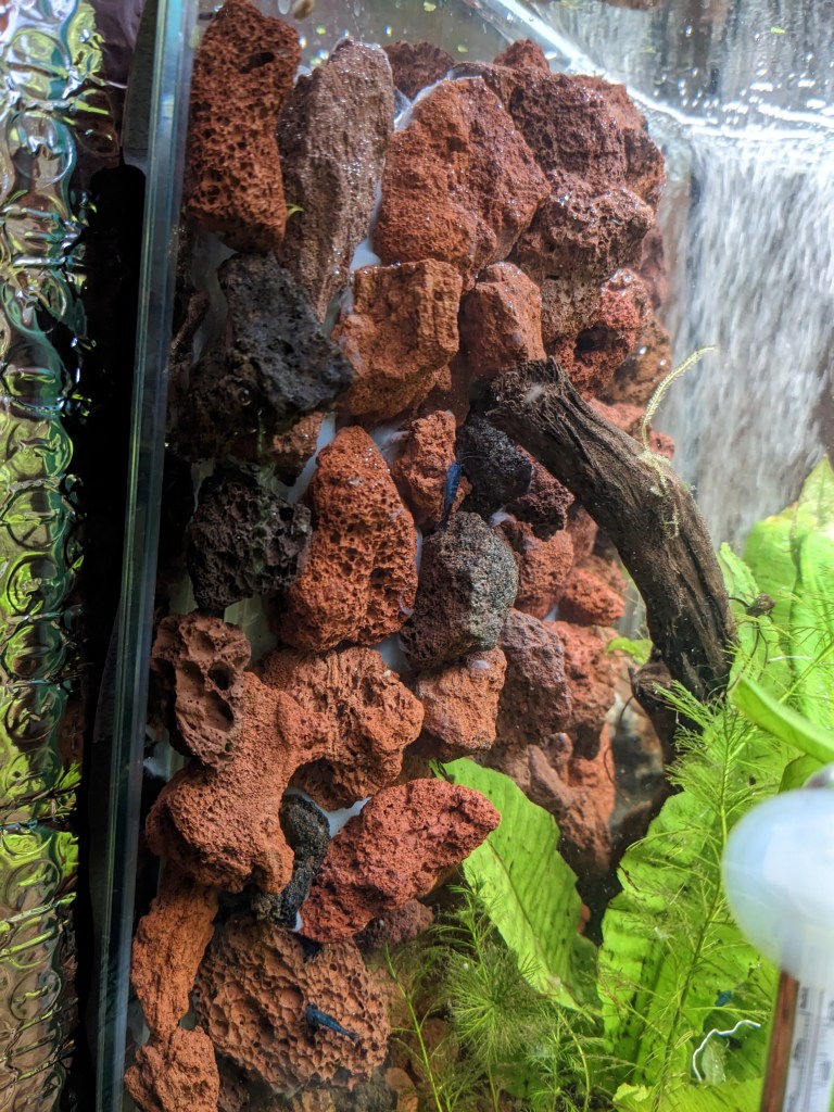
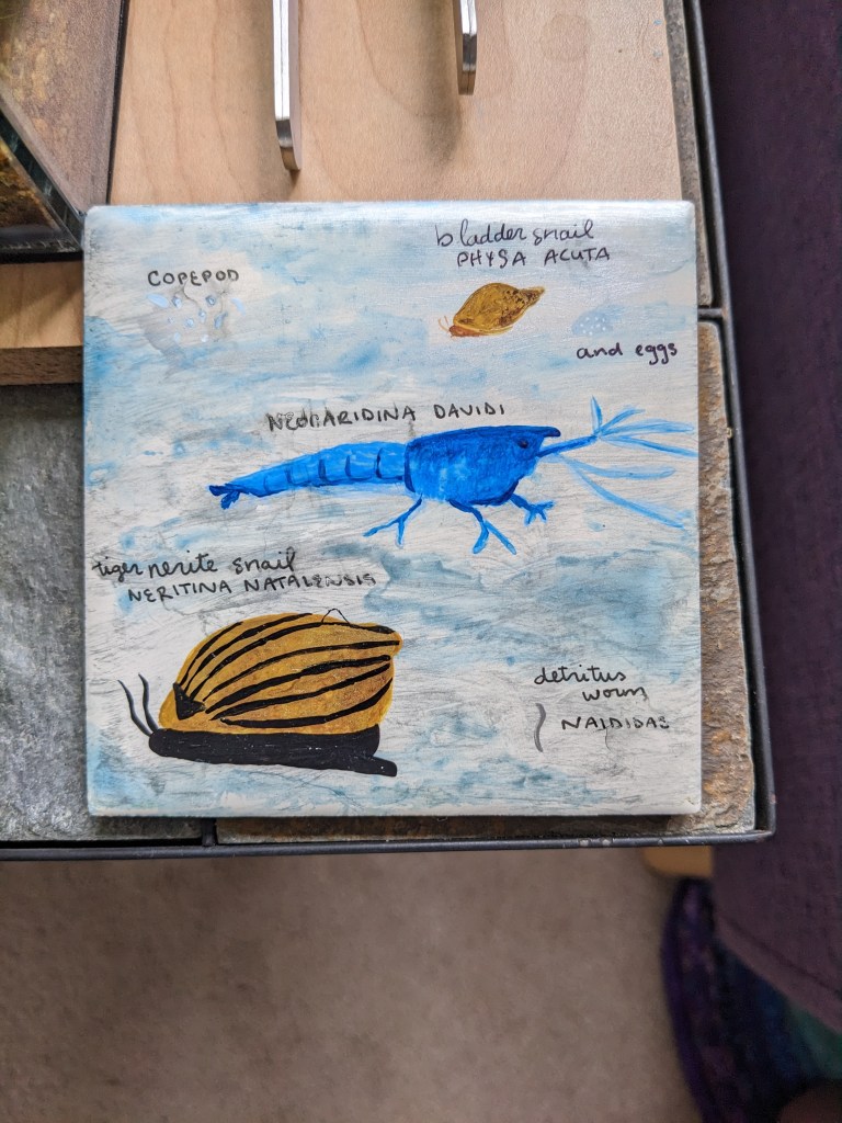
Leaf collages with my cousinLeaf watercolor for my auntAdded the reflection to this muralRainbow crochet scarf for my friendPainted the mini for my character in Dungeons & Dragons (dragonborn sorcerer named Taro)Company sent me this mini on accident, painted it to look like a solider from the Xi’an terracotta excavationBaby quilt for my friendsBaby quilt for my friendsVolcano for a D&D settingVolcanoes and observatory for D&D settingCrochet elephant partsCrochet elephantPottery painting beforeAnd after, featuring taquitosLava rock wall for my shrimp tankSpecies sign for my shrimp tankAcrylic paint collab with my friendAcrylic paint collab with my friend
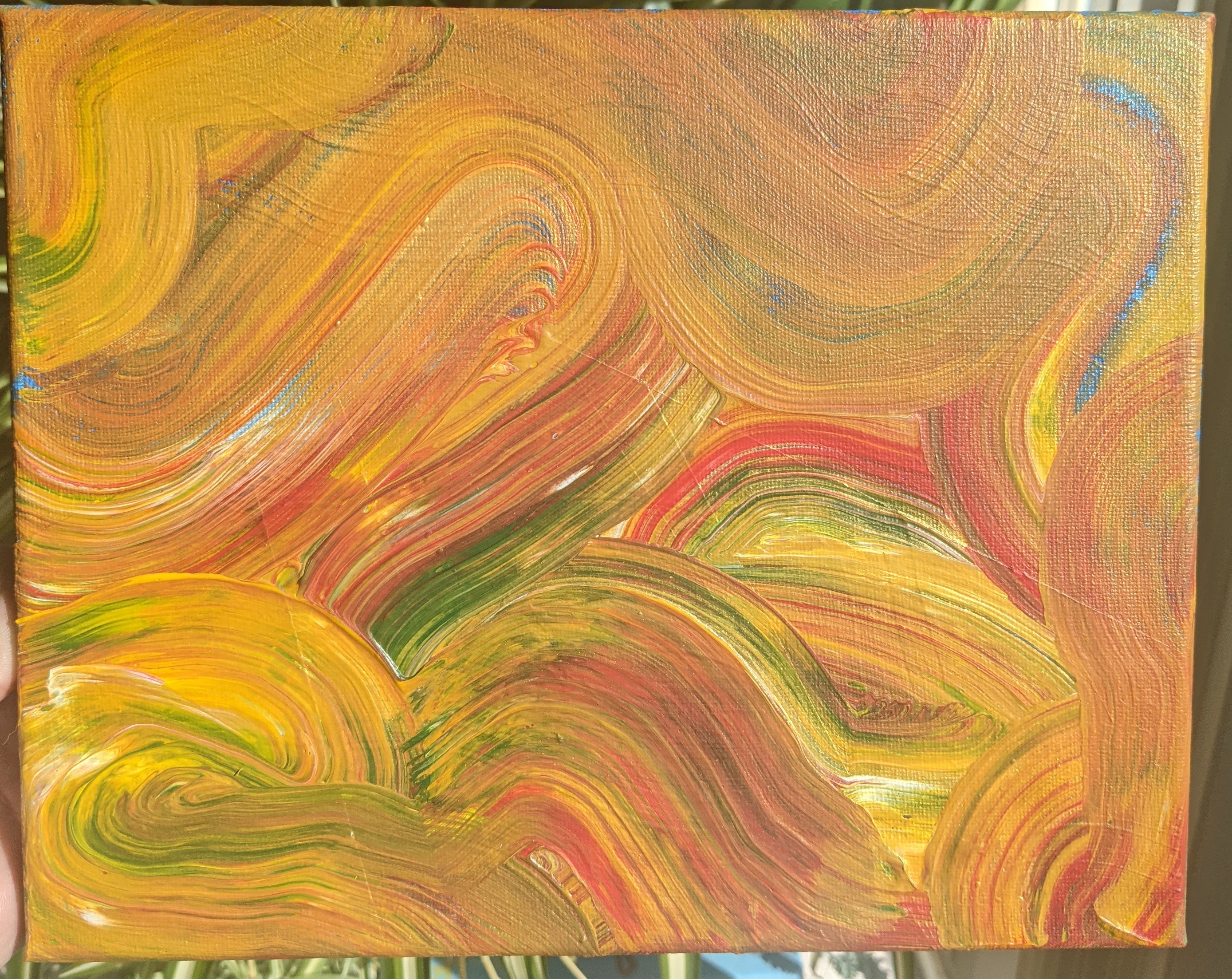
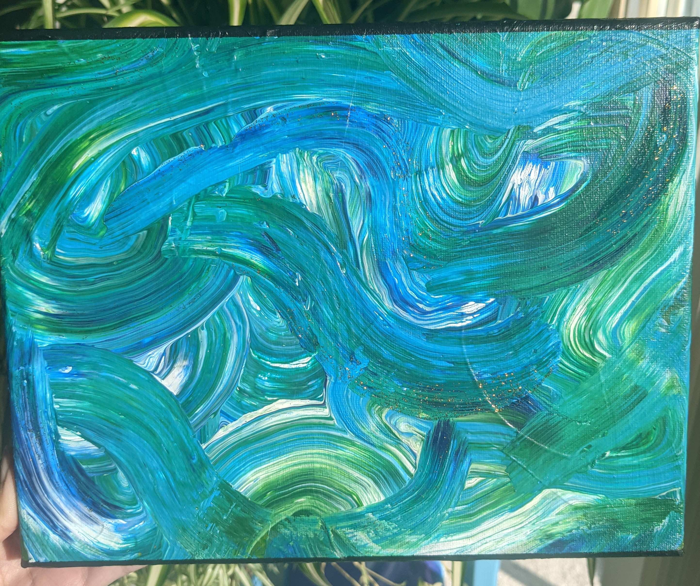
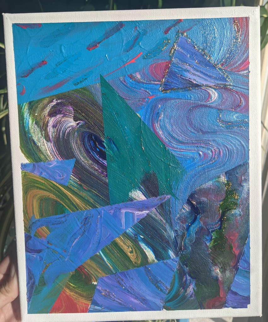
I was inspired to pick up the brush again by katiesstudio on TikTok; I wanted to try out their “swirl the blobs” technique of moving and mixing color across the canvas. And of course, I brought my masking tape techniques with me.
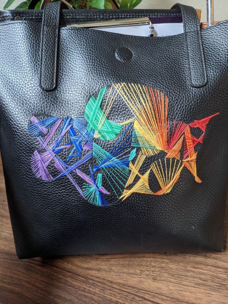
Then I wanted to take this color blending kick over to my embroidery, because I already have variegated thread in lots of colors (shout out to Walmart for the thread).
I use this as my choir bag now 🙂
An of course my next question is… how can i incorporate this into my quilting? I’ve been thinking about trying more detailed pieces and more “thread painting”, and I think this abstract color blending mood could bring me into that. 🙂
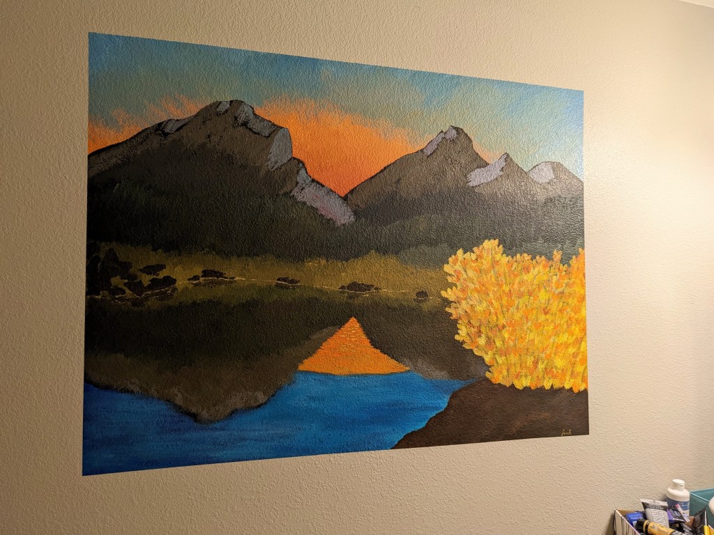
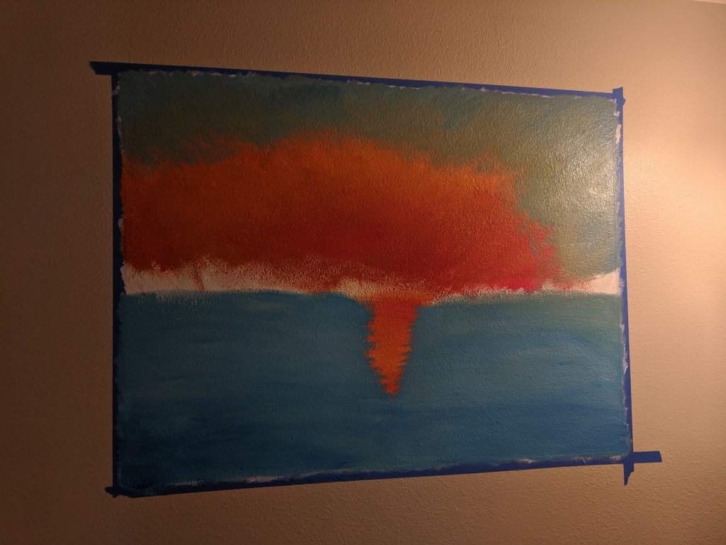
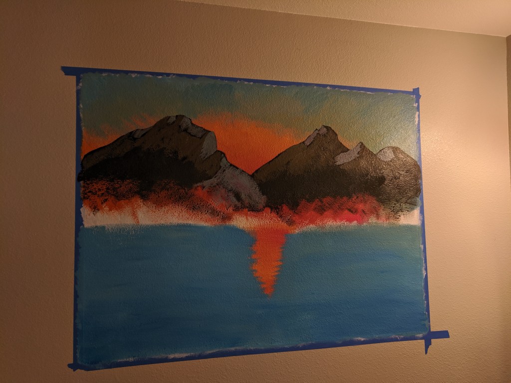
I painted this mural as a combination of a Bob Ross / Rocky Mountain National Park / Glacier National Park homage 🙂 My downstairs bathroom used to be a total gray box and I wanted to fill the space without spending a ton of money. It finished up at about 43″x47″. I used acrylic paint and paintbrushes from Michael’s and some painter’s tape.
I watched a bunch of Bob Ross tutorials before embarking on this painting, and I knew I wanted a mountain and sunset scene.
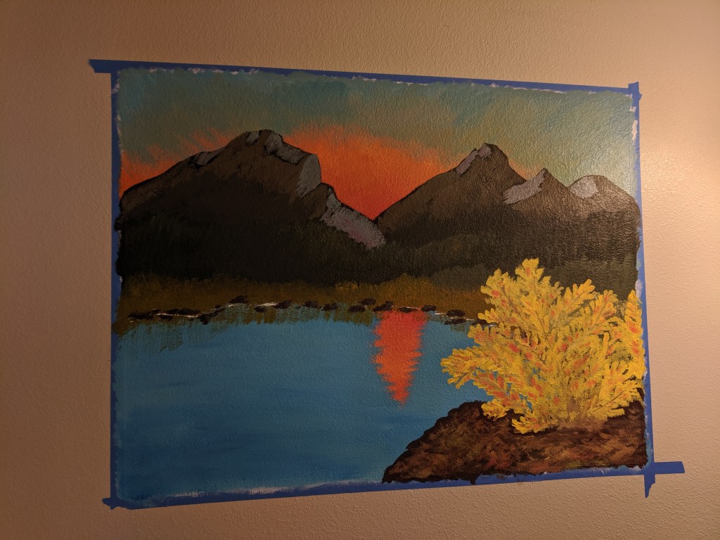
The mountains on the left are a big Glacier NP inspired, and the ones on the right RMNP inspired.I also added this autumnal bush for interest and fun!
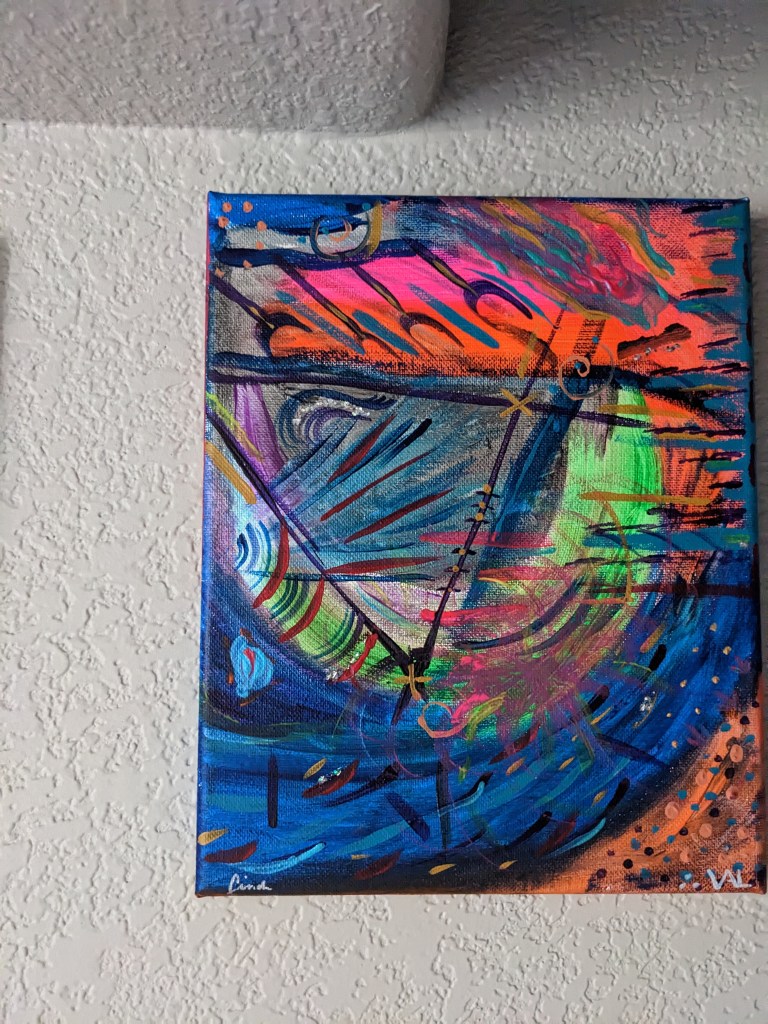
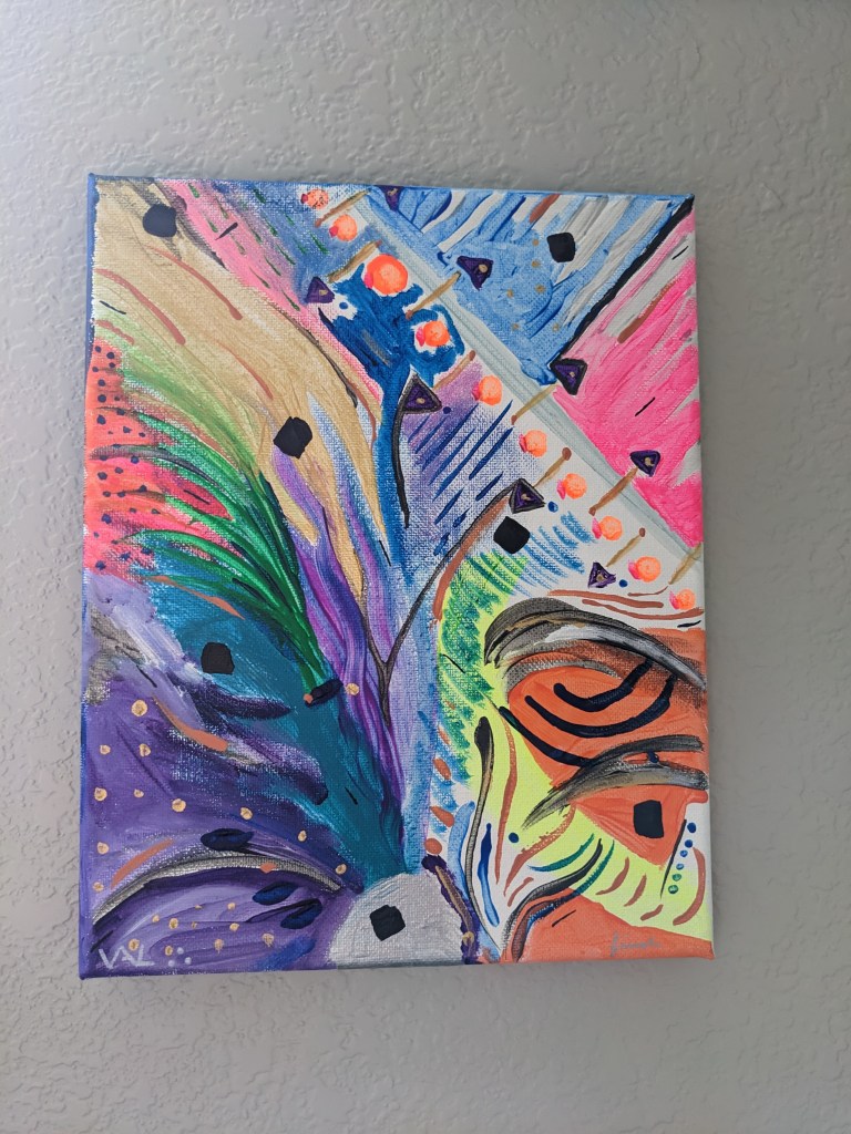
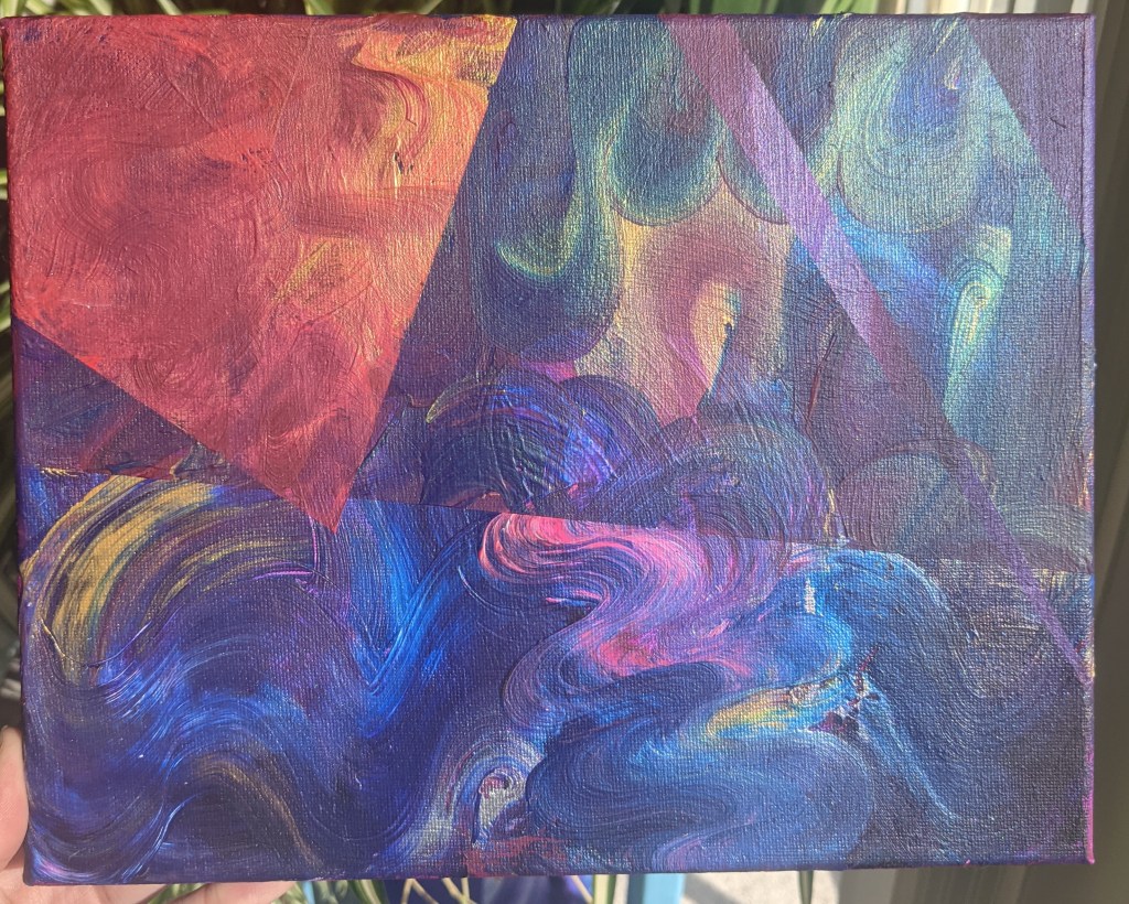
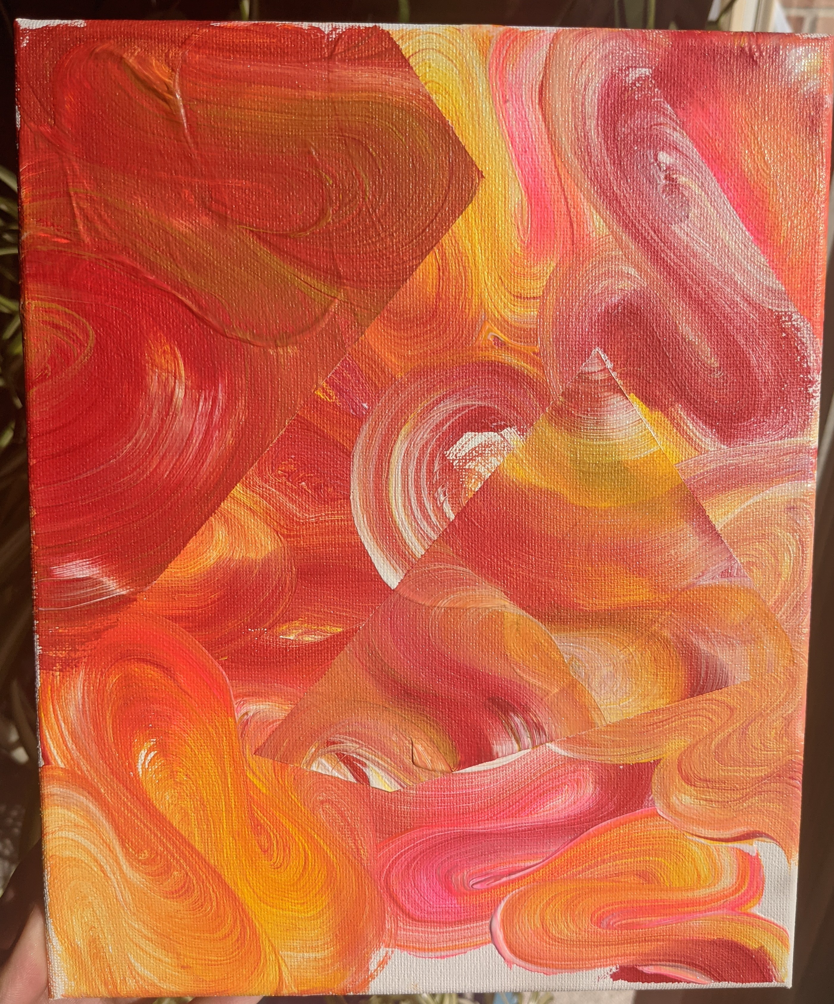
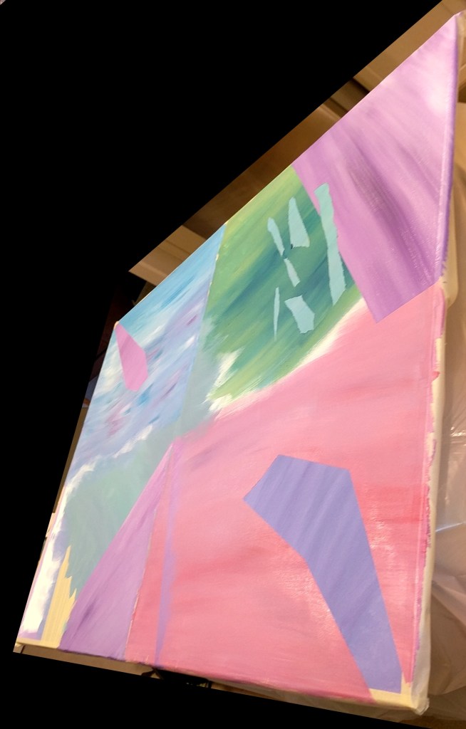
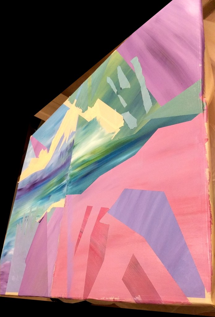
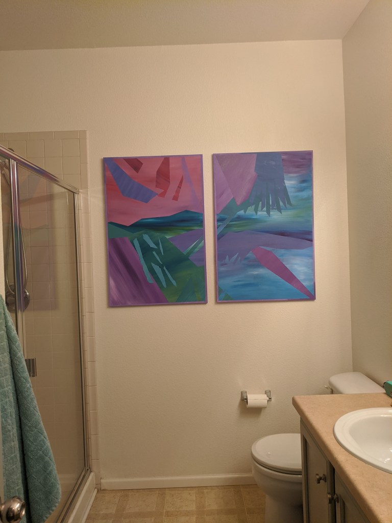
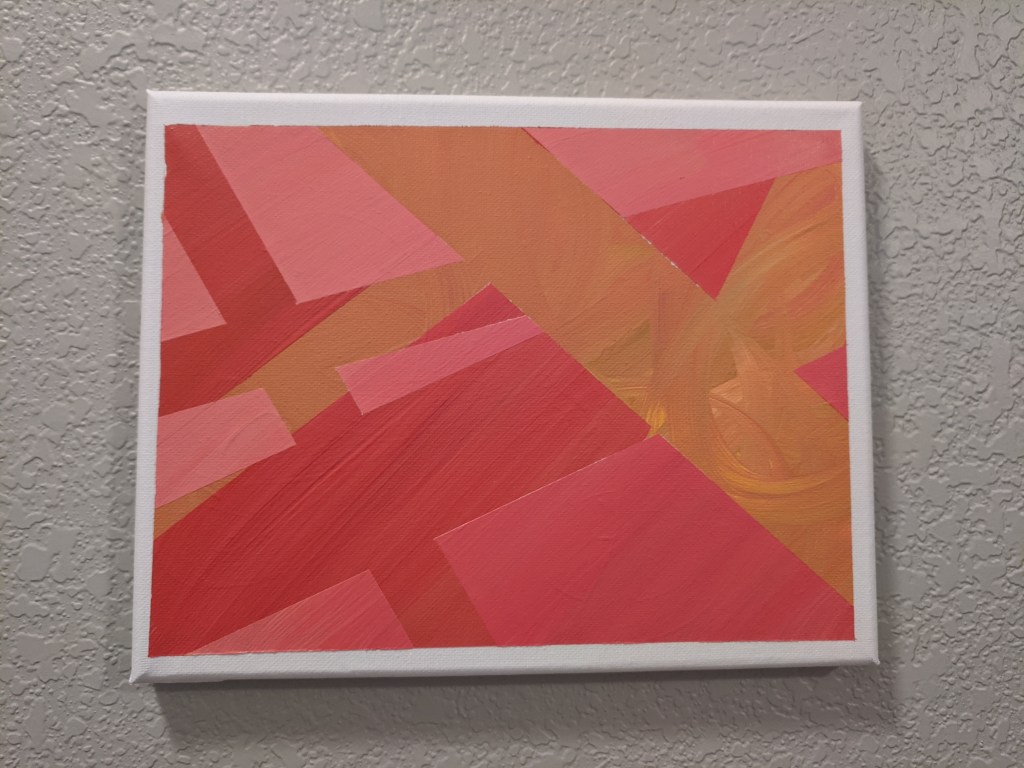
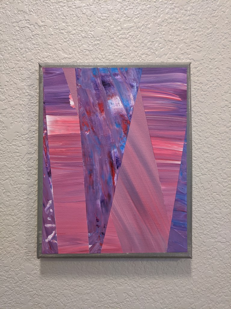
So these started out as a project for my bathroom, since I had a big wall to fill but buying something ~50″ can be expensive. I taped these two canvases together and then used masking tape to create different shapes and straight lines.
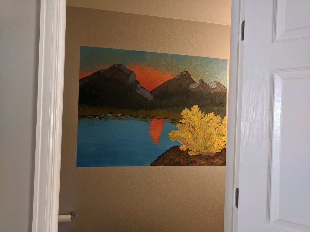
Finished and hung up!
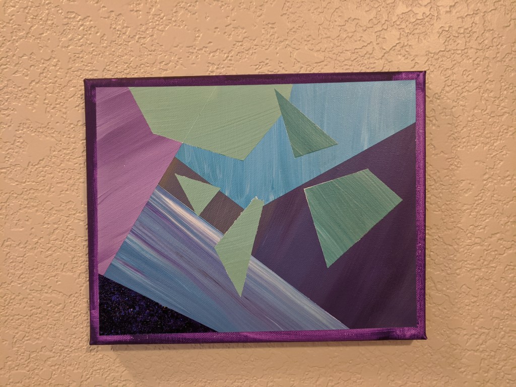
Then, because I had so much fun with those, I bought some small canvasses (8″ x 10″) on clearance and now I’m working on making a little collection that will hang in my entryway.
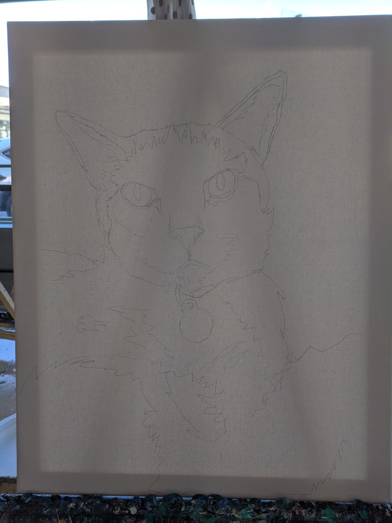
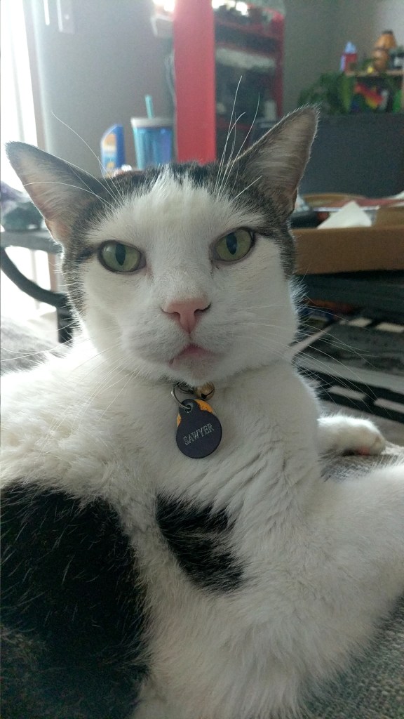
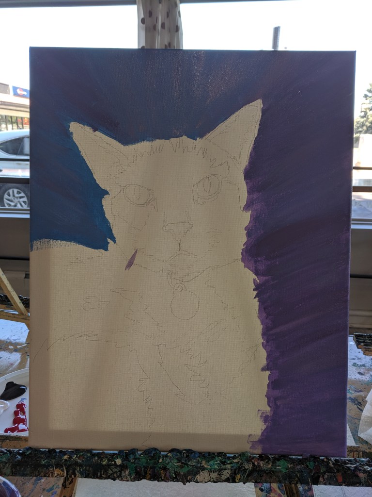
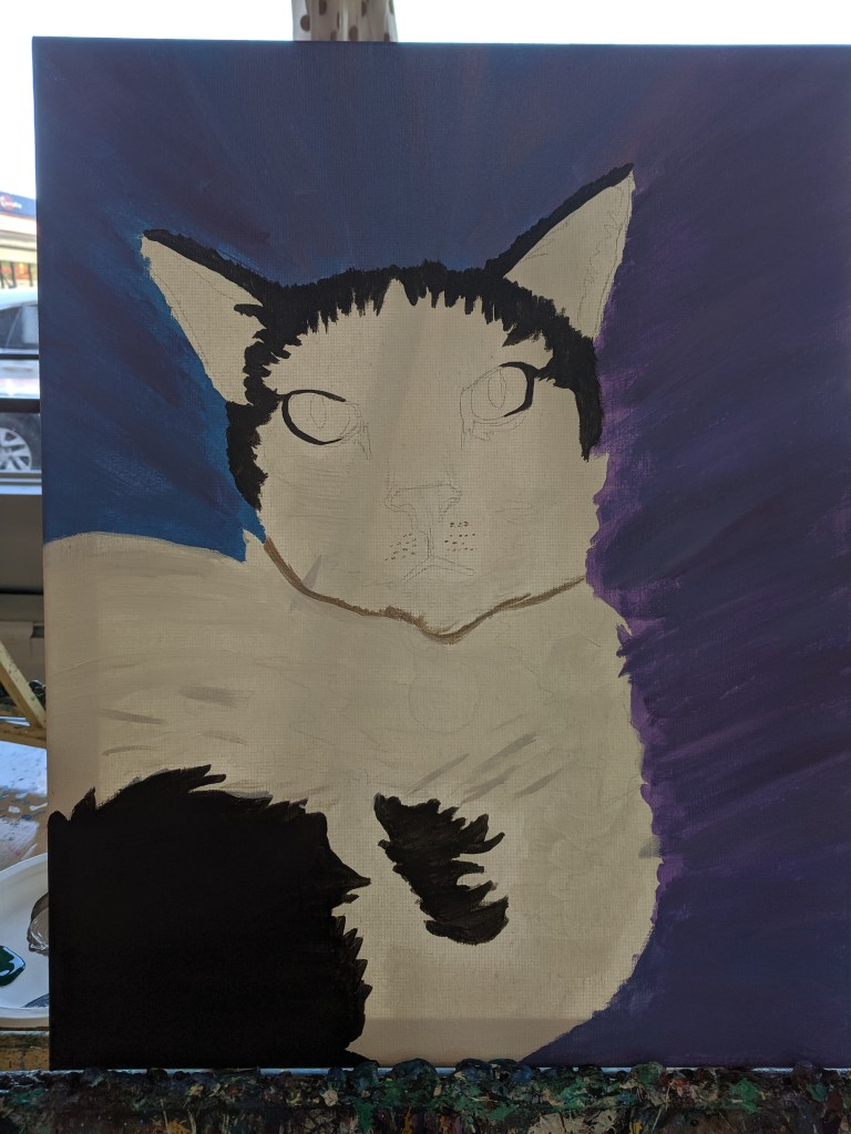
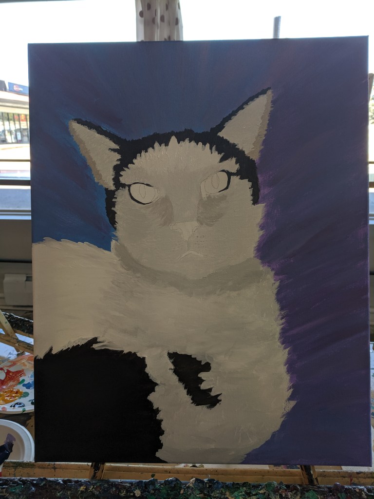
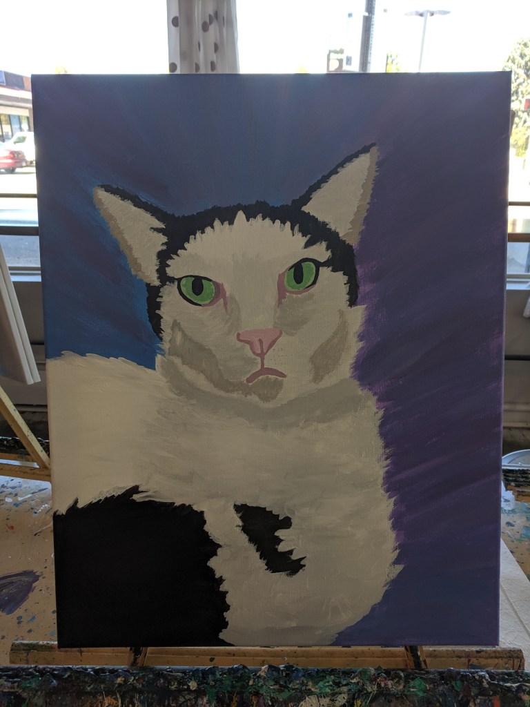
My friend and I went to Sipping N Painting in Denver, one of the pretty standard paint and drink places 🙂 Except they used a photo of our pet to sketch the outline on a canvas for us, and then we filled it in!
It was originally supposed to be more of an abstract thing using one color in different shades to define highlights and lowlights within the picture, but I decided that I’d do realistic colors (along with the other 3 people in the class) since my cat is just black and white.
Since it was made off a picture-perfect sketch, the true emotion of his Judgement really comes through, which is a true joy. He looks at me with this face all the time and I’m really glad I captured it in painting form.
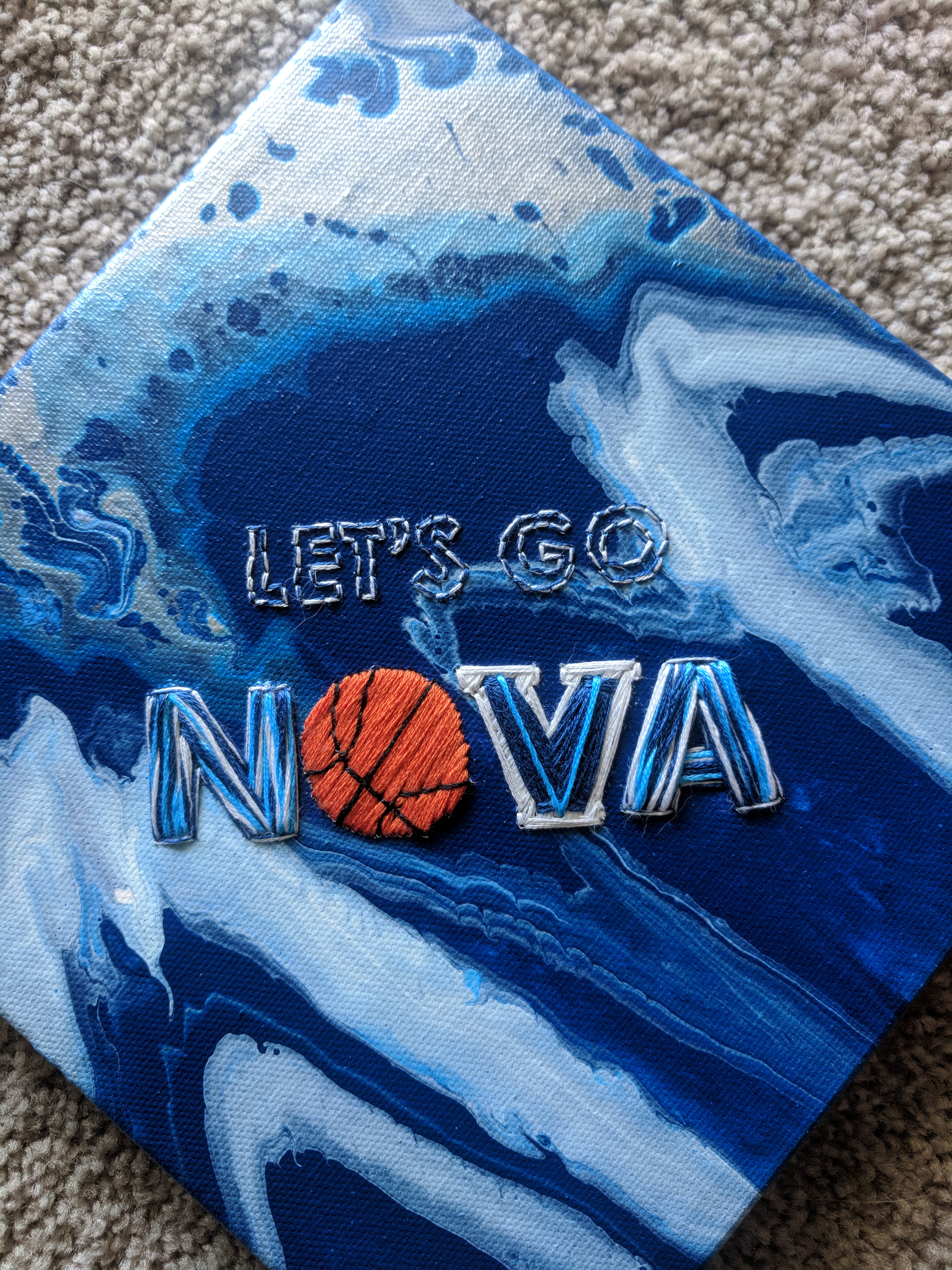
Go Wildcats! I went to Villanova for a time, and made this for a fellow Villanovan in celebration of their win in the NCAA March Madness tournament. I used a canvas from Joann and some acrylic paints to do a paint pour with the Villanova colors. Paint pours are super simple and usually turn out awesome (if you stop while you’re ahead instead of messing with it too much). You just mix paint with some water or flow acrylic (a special product to make paint move easier), and pour it on the canvas. Then you tilt the canvas around to make the paints move and mix together.
After the canvas dried, I traced my pattern onto the back of the canvas so I would know where to stitch. The pattern is mainly backstitches and satin stitch, with 6-strand thread for maximum fluffiness and volume. Canvasses are a bit tricky to stitch in since the holes don’t close up as easily as with fabric, but I was dedicated to the paint pour background so I stuck through it.